
Product Photo Consistency: How to Make One Catalogue Look Like One Brand
August 11, 2026 · 8 min read · by Aashirvad Kumar
Your credits refresh every month for as long as ListingRVA AI exists. No renewals, no annual increases, nothing to cancel.
Available on select plans. No renewals, ever.
August 11, 2026 · 8 min read · by Aashirvad Kumar
Open your own category page and look at it the way a first-time visitor does, as a single grid rather than a set of products. One item sits large and tight in its frame, the next floats with a wide margin. One casts a soft shadow to the left, another has none. Two backgrounds are white and one is faintly warm. Nothing there is a bad photograph, and yet the page looks careless, which is the recognisable signature of poor product photo consistency.
The cause is almost always the same. The catalogue was not shot, it accumulated. A first batch on a phone by the window, a second at a rented studio, a third by a supplier who sent whatever they had, a fourth done in a hurry before a seasonal launch. Every batch was reasonable in isolation. Nobody wrote down what the previous batch had done, so each one quietly re-decided crop, height, light and background.
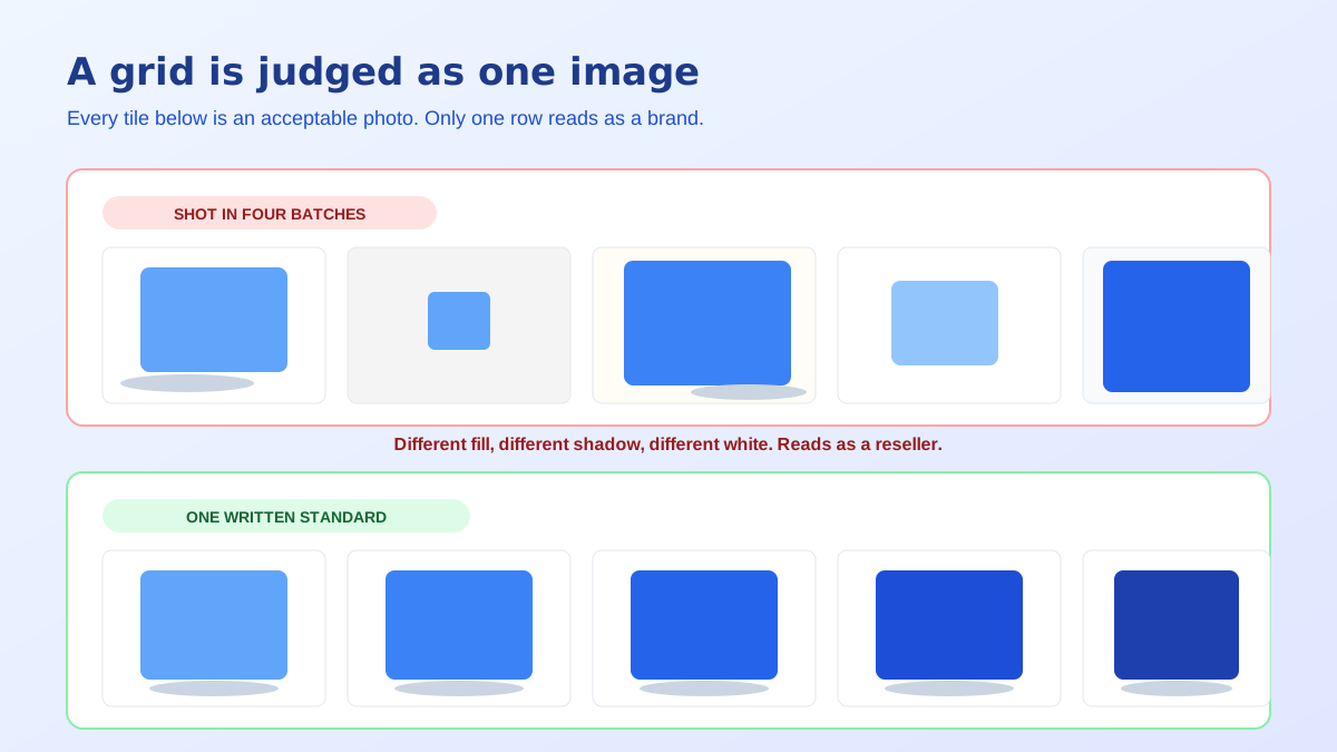
Shoppers do not evaluate thumbnails individually. They scan a row, and what registers first is rhythm: whether the objects sit at a similar size, whether the whites match, whether the shadows fall the same way. When those things agree, the page reads as a curated brand. When they disagree, the page reads as a reseller aggregating stock from several sources, and that impression forms well before anyone has looked at a price.
This is why fixing one photograph rarely helps. A beautifully lit hero dropped into an inconsistent grid becomes another outlier, and the grid gets slightly worse. Consistency is a property of the set, not of the file, which means the unit of work is the catalogue and the deliverable is a standard rather than an image. Sellers who understand that stop reshooting individual products and start writing rules.
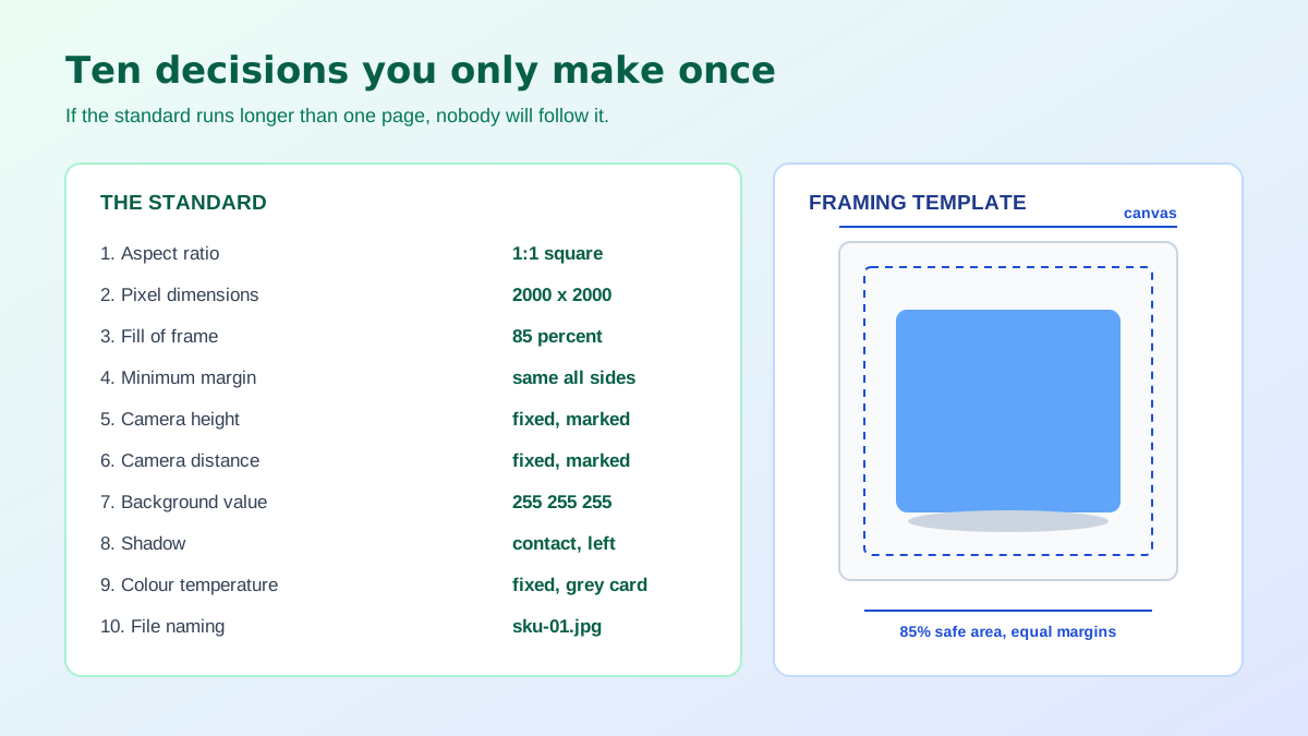
The most visible inconsistency is not colour, it is size in frame. Two products at 60 and 85 percent fill look wrong together even when everything else matches, because the eye compares occupied area across the row. Fix a single fill percentage for the whole catalogue, along with a minimum margin on every side, and apply it to the crop rather than to the shoot. Amazon expects roughly 85 percent fill on the main image, which is a sensible default to inherit.
Camera height and distance belong in the same line of the standard. A product shot from eye level and its neighbour shot from thirty degrees above will never sit comfortably together, and no amount of retouching fixes a perspective difference. Write down the height, the distance and the focal length, then tape a mark on the floor. The specific numbers matter far less than the fact that they stop being re-invented on every shoot.
White is not a description, it is a value. Amazon requires the main image background to be pure white at RGB 255 255 255, and a backdrop that photographs at 246 will look perfectly white on its own and unmistakably grey beside a compliant neighbour. Sample your finished files with a colour picker rather than trusting your eye, because a screen at low brightness hides exactly this problem.
If you sell off-marketplace and prefer a tinted or textured background, the rule does not change, only the number does. Pick the value, record it, and check every file against it. Most of the grey-white drift in real catalogues comes from a metering problem rather than a backdrop problem, which is one of the failure modes covered in the product photo lighting mistakes breakdown.
Decide once whether products sit on a contact shadow, a soft cast shadow or nothing at all, and if there is a shadow, decide which direction it falls. Mixed shadow direction across a grid is jarring in a way most people cannot name but everyone notices. The same applies to reflections: either every product sits on a reflective surface or none of them does.
Colour needs a fixed white balance rather than an automatic one, because auto white balance re-evaluates every frame and will hand you two different browns for the same wooden bowl. Set a specific colour temperature, put a grey card in the first frame of each session, and correct the whole batch from it. Then agree the aspect ratio, the pixel size and the file naming pattern, because a standard that stops before the export step gets undone during upload.
Those export rules are also where marketplaces impose their own arithmetic, and a set that is consistent in your folder can arrive inconsistent on the storefront if the source sizes vary. Uploading one square master per SKU and letting the platform derive the rest is the safest route, and the specifics of that pipeline are set out in the Shopify product image specs.
A workable standard is ten lines long: aspect ratio, pixel dimensions, fill percentage, margins, camera height, camera distance, background value, shadow type and direction, colour temperature, file naming. Anyone who shoots for you, including a supplier or a freelancer, should be able to follow it without a conversation. If it takes more than one page, it will not be followed.
Before producing anything new, build a contact sheet. Export every main image at thumbnail size into a single grid and look at it as one picture. Outliers surface within seconds in that format, while opening files one at a time hides them completely, because each image looks fine when nothing sits beside it for comparison. This is the cheapest quality control available and almost nobody does it.
Sort that sheet by the date each product was added and the drift usually resolves into blocks, one per shoot. That tells you which batch to redo first and, more usefully, which batch is your accidental house style. Often the largest block is close enough to a standard already, and the work is bringing thirty stragglers into line rather than rebuilding four hundred images from scratch. Check the block you adopt against the marketplace rules before you standardise on it, since a house style that quietly breaks the main-image spec is worse than drift, and those rules are listed in the Amazon image requirements guide.
Producing images from a clean source photograph removes most of the physical causes of drift. There is no room light changing between Tuesday and Thursday, no second photographer with a different instinct for camera height, no supplier sending files at a different aspect ratio. Backgrounds can be made identical across an entire catalogue in an afternoon, and cleaning a mismatched original down to a neutral cutout takes seconds with the free background remover tool.
The failure mode simply moves. If you generate each product with whatever style felt right that day, you will manufacture the same incoherent grid faster than a camera ever could. Treat your generation settings the way you would treat a lighting setup: choose the style, the framing and the background once, record them, and reuse them for every SKU and every variant. Used that way, AI product photography is the strongest consistency tool a small catalogue has ever had.
Variants deserve their own rule inside the standard. A product sold in six colours has to be photographed at exactly the same angle and distance in all six, because the swatch strip flips between images in place and any shift in position registers as a jump. Generate or shoot the whole variant family in one pass rather than adding colours as they are introduced, and the strip stays still while only the colour changes.
The same discipline applies to secondary slots. If slot four is the dimension slide on one product and a lifestyle scene on the next, a shopper comparing two of your listings side by side has to relearn the layout each time. Fixing the meaning of each slot across the catalogue costs nothing and makes the whole range feel deliberate, which is the impression the standard exists to create.
The payoff is not aesthetic. A coherent grid signals that a real brand is behind the listing, and that impression carries into how buyers read your price and your reliability. Product photo consistency is one of the few catalogue-wide improvements that costs almost nothing once the standard exists, because from then on it is a decision you never have to make again.
Because a grid is judged as one image, not as twenty. Individually acceptable photos with different crop margins, shadow directions and background values create a jagged rhythm across the row, and the eye reads that as disorder before it reads any single product. Consistency between images matters more on a category page than the quality of any one of them.
Aspect ratio and pixel dimensions, the percentage of the frame the product fills, margin on each side, camera height and angle, distance from the product, background value, shadow type and direction, colour temperature, and file naming. Nine or ten lines is enough. The point is that every one of them is a decision someone would otherwise make again on each shoot.
Fix the white balance to a specific colour temperature rather than leaving it on automatic, since auto white balance changes its mind between shots and between products. Include a grey card in the first frame of every session and correct the whole set from it. Then check the finished files on the same screen, not on whichever device is nearest.
On Amazon the main image background must be pure white, RGB 255 255 255, which is a specific value rather than a general impression of white. A backdrop that photographs at 246 looks white on its own and visibly grey next to a compliant neighbour. Off-marketplace you can choose any background, but choose one and apply it everywhere.
Build a contact sheet: put every main image into one grid at thumbnail size and look at it as a whole. Outliers announce themselves in seconds, in a way they never do when you open files one at a time. Sort the sheet by the date the product was added and the drift usually maps directly onto separate shoots.
Only if you treat the settings as a standard rather than a starting point. The same style, the same framing instruction and the same background choice, reused for every product, produce a coherent set. Generating each product with whatever settings felt right that day reproduces exactly the drift you were trying to escape, in less time than a camera would take.
ListingRVA AI now works inside Claude. Connect your workspace and ask Claude to generate listing copy and publish product images to your store, without leaving your editor. See the Claude connector →
Comments
No comments yet, be the first.
Leave a comment