
Showing Product Size in Images: Scale Cues That Stop Returns
August 13, 2026 · 8 min read · by Aashirvad Kumar
Your credits refresh every month for as long as ListingRVA AI exists. No renewals, no annual increases, nothing to cancel.
Available on select plans. No renewals, ever.
August 13, 2026 · 8 min read · by Aashirvad Kumar
The dimensions were in the bullet points. They were in the specification table. They were probably in the title. The buyer still opened the box, said it is much smaller than I expected, and sent it back at your cost. That pattern repeats across categories with such regularity that showing product size in images should be treated as a core listing task rather than an optional extra frame nobody gets around to.
The reason written dimensions fail is not carelessness. It is that a number is not a picture. Very few people can convert 18 centimetres into a mental image on demand, and nobody stops mid-scroll to hold a ruler against their desk. The specification is a verification tool for someone who already has an expectation, and the expectation was set entirely by your photographs.
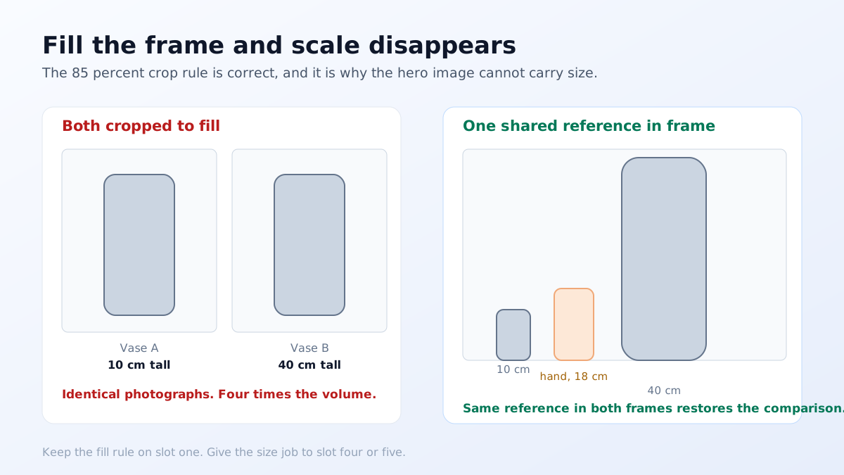
Standard practice is to crop every product so it fills roughly 85 percent of the frame. That rule exists for good reasons: it maximises the product in a thumbnail, it looks tidy in a grid, and most marketplaces effectively require it. It also has a side effect nobody mentions, which is that it deletes every trace of relative size. A ten centimetre vase and a forty centimetre vase, both cropped to fill, are the same photograph.
Inside a single brand's catalogue this is worse still, because buyers use your own range as their reference. If every item is shot at the same fill, a customer who bought your small planter and liked it has no way to tell that the next one is four times the volume. The fix is not to abandon the fill rule on the hero image. It is to accept that the hero image cannot carry size information, and to assign that job explicitly to another frame. Once you think of showing product size in images as a slot assignment rather than a styling choice, the rest of the decisions become mechanical: which frame, which reference, which position in the carousel.
A scale reference only works if the viewer already knows the size of the reference. An adult hand is the strongest one available for small products, because every buyer has calibrated their own hand over a lifetime. A bank card is excellent for flat objects, since the ID-1 format is standardised at 85.6 by 54 millimetres in every country. A doorway or a seated person works for furniture. A standard sheet of A4 or Letter paper works for anything desk-sized.
The references that fail are the local ones. A coin means nothing to a buyer in another country. A branded coffee cup varies by chain and region. A pencil, a matchbox and a smartphone all vary enough that the viewer has to guess which variant you used, and a guess is exactly the thing you were trying to eliminate. When you do use a hand, keep it relaxed and open rather than gripping, because a tight grip hides the object and destroys the comparison you were making.
For anything larger than a hand, the dimension graphic is the workhorse. Photograph the product square to the camera on a plain background, then overlay clean measurement lines with end caps for width, height and depth, with the numbers in both centimetres and inches. Keep the type large: a good test is whether every number is legible when the image is displayed 500 pixels wide, because that is roughly what a phone gets.
Two mistakes recur. The first is measuring to the wrong points, for example giving the height of a chair to the seat rather than the backrest, which reads as deception even when it was an oversight. The second is putting those measurement lines on the main image. Most marketplaces require the main image to show the product alone with no added text, graphics or arrows, and a dimension overlay in slot one is a routine cause of image suppression. The full set of thresholds is in the Amazon main image rules.
A short focal length used close to the subject enlarges whatever is nearest the lens, which is why a phone's wide camera held 20 centimetres from a mug makes it look bulbous and oversized. Buyers cannot articulate this, but they register the mismatch when the real object arrives looking narrower and flatter than the photo. Step back and zoom, or use something equivalent to a 50 to 85 millimetre lens, and the proportions match what the buyer will hold. The same discipline governs which viewpoints are worth shooting at all, which the product photography angle checklist works through frame by frame.
The most persuasive size cue is not a graphic at all. It is the product sitting in a real environment with familiar objects around it: a lamp beside a sofa, a bottle on a kitchen counter next to a tap, a print on a wall above a chair. Buyers read those scenes without effort because the surrounding objects are all things whose size they already know, and the product's dimensions arrive as an inference rather than as a claim.
That is also why the room shot has become the highest-value secondary frame in home categories. It answers will it fit and will it look right in one image, and it does it in the half second a buyer spends before scrolling on. Getting the proportions of that scene correct matters more than making it beautiful, and the mechanics of building those scenes are covered in the home decor photography guide.
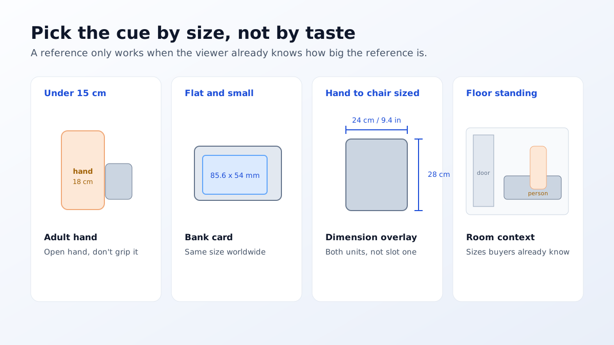
Pick the technique by product size rather than by preference. Under about 15 centimetres, a hand. Flat and small, a bank card. Between a hand and a chair, a labelled dimension frame. Furniture and anything floor-standing, a room context frame with a person or a familiar piece of furniture in it. Very small precision items, a macro next to a millimetre scale, since a hand stops being informative below roughly two centimetres.
Then place the frame where it will be seen. Image slot viewership falls off sharply, so a size frame sitting in slot eight is being seen by a small fraction of the people who saw slot one. Fourth or fifth is a reasonable default. In categories with chronic size confusion, small home decor, eyewear, jewellery and anything sold flat-packed, move it to slot two and push a styling frame back instead. Whatever text sits on that frame should also be echoed in the copy, and an AI product description generator will pick the dimensions up from your specification fields if they are entered properly.
None of this is expensive, which is what makes size the cheapest return-rate improvement available. A dimension frame is one photograph and twenty minutes of layout. A room context frame used to be the costly one, since it meant either owning a set or paying for a location, and that is exactly the constraint AI product photography removed: a clean product photograph can be placed into a plausible room at whatever scale you specify, and you can produce several so the buyer sees the object beside more than one familiar reference.
Do not treat any of this as a one-off task either. Every time you add a variant, change packaging, or extend a range with a larger version of an existing product, the scale relationship inside your own catalogue shifts and the old size frame quietly stops being accurate. Reviewing the size frames whenever a range changes takes minutes and prevents the specific failure where a customer orders the large expecting the proportions of the small.
The measure of success in showing product size in images is not that the image looks informative to you. It is that the phrase smaller than expected stops appearing in your reviews. Track that phrase, and the equivalent for larger than expected, before and after you add a size frame. It is one of the very few image changes with a direct, readable signal in the data rather than an argument about aesthetics.
Because a number is not a picture. Most people cannot convert 18 centimetres into a mental image without something to compare it against, and almost nobody stops mid-scroll to measure their desk. Written dimensions are a verification tool for someone who already has a rough expectation. The image is what creates the expectation, so if the image implies the wrong scale the specification will not correct it.
For small products, an adult hand, because every buyer has calibrated their own. For flat items, a bank card works well since the ID-1 format is standardised at 85.6 by 54 millimetres worldwide. For furniture and large goods, a person or a doorway. Avoid coins and local objects, which vary by country and mean nothing to half your audience.
On most marketplaces no, because main images generally have to be the product alone with no added text, graphics, arrows or logos. Dimension callouts belong in secondary image slots. Putting measurement lines on the main image is a common cause of image suppression, and it is an avoidable one since slot four or five performs the same job without the risk.
A short focal length used close to the product exaggerates the nearest part of it, so a mug photographed from 20 centimetres away with a phone's wide lens looks larger and more bulbous than it is. Stepping back and zooming, or using a longer lens equivalent to roughly 50 to 85 millimetres, produces proportions that match what a buyer will see in their hand.
Both, on the same graphic, with the primary unit for your main market first. It costs a few characters and removes an entire class of mistake for cross-border buyers. Keep the numbers large enough to read at thumbnail scale, since a dimension image nobody can read at 500 pixels wide is doing nothing at all.
Fourth or fifth, after the hero and the detail frames. Viewership drops sharply with each slot, so a size image placed last is seen by very few people. If your category has a chronic size confusion problem, such as small home decor or eyewear, move it to slot two and let a styling frame take the later position.
ListingRVA AI now works inside Claude. Connect your workspace and ask Claude to generate listing copy and publish product images to your store, without leaving your editor. See the Claude connector →
Comments
No comments yet, be the first.
Leave a comment