
Phone Accessory Photography: Make Fit Impossible to Misread
August 6, 2026 · 8 min read · by Aashirvad Kumar
Your credits refresh every month for as long as ListingRVA AI exists. No renewals, no annual increases, nothing to cancel.
Available on select plans. No renewals, ever.
August 6, 2026 · 8 min read · by Aashirvad Kumar
Nobody browsing a phone case is admiring the photograph. They are trying to establish one fact: does this fit the exact handset in their pocket. Phone accessory photography lives or dies on that single question, and a gallery of beautiful floating renders answers it less well than one plain, slightly boring picture of the case sitting on the actual device with the camera module framed correctly.
The reason this category generates so many pre-purchase messages is that the differences between models are small in a photograph and decisive in reality. Two handsets from the same family look the same on screen, then the camera island is a few millimetres wider on one of them and the case does not close. The buyer knows this from experience, so scepticism is the default state and your images have to overcome it.
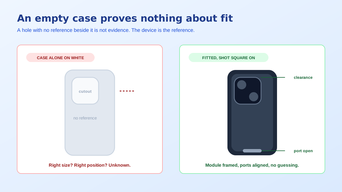
A case photographed on its own is a shape with holes in it. The buyer can see that a hole exists, but not whether it is the right size, in the right place, or cut for the right lens arrangement. There is no reference in the frame, so the image conveys colour and texture and nothing about compatibility, which is the only property the shopper came to check.
Put the same case on the device and every one of those unknowns resolves at a glance. The camera module sits inside the opening with visible clearance. The buttons are covered or exposed as designed. The bottom edge shows the speaker grille and the charging port with the openings lined up. One photograph replaces a paragraph of specification that most shoppers would not have read anyway.
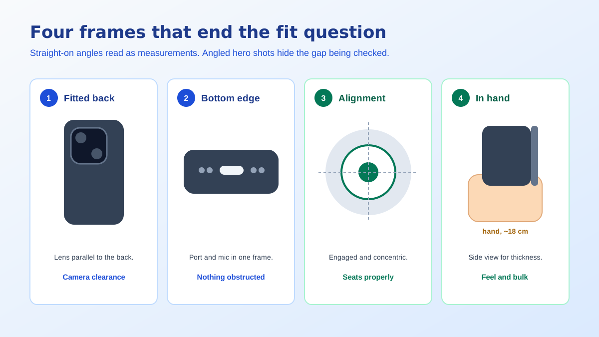
Photograph the case on the phone from directly above the back panel, lens parallel to the surface. Any tilt introduces perspective, and perspective is exactly what makes a buyer suspicious, because it hides how much room actually surrounds the camera module. A square-on shot reads as a measurement rather than a marketing image, and that is the tone this category rewards. It is the single most valuable frame in the set.
Light it so the cutout edge is visible against the device body rather than lost in shadow. A dark case around a dark camera housing photographed with one hard source becomes a black blob with no readable boundary, which returns the buyer to guessing. The angle discipline behind these shots is covered more generally in the product photography angles guide.
Shoot along the bottom edge, close, with the charging port opening in the centre of the frame. This answers two questions at once: that the port is not obstructed, and that a normal cable will physically reach it through the thickness of the case. Anyone who has bought a thick case and discovered their cable no longer seats properly checks this image first, and its absence is a real reason to leave.
The same shot carries the speaker and microphone cutouts, so one frame closes three doubts. If the case has a raised lip around the screen, photograph the phone face down on a flat surface from a low angle to show the gap. Lip height is a genuine buying criterion and almost nobody photographs it, which makes it an easy point of differentiation.
If the accessory involves magnetic attachment or a mount, the alignment has to be shown, not stated. Photograph the case attached to its charger or mount, seated and centred, so the buyer can see the connection is concentric rather than approximate. For mounts, show the phone held at the angle it will actually sit at, with the clamp or magnet contact visible instead of cropped out of the frame.
Cables and chargers have a version of the same problem. The connector type is the fit question, so the connector should be photographed large and unobstructed rather than coiled decoratively in the corner of a lifestyle scene. Where a product supports fast charging at specific wattages, put the number in the image only if it matches the figure you can support in your listing copy and packaging.
Compatibility text belongs in the gallery too, not only in the bullets. One image listing every model the accessory fits, and naming the close neighbours it does not fit, prevents the single most expensive error in this category. The same list should appear in the title where it will index, which the free Amazon title generator handles inside the character limit.
Thickness decides whether a case feels like protection or like a brick, and it cannot be read from a flat back panel photograph. Show the case in a hand, gripped normally, from a side angle. This doubles as the scale reference and as the material cue, because the way the surface deforms under a finger tells the viewer whether it is rigid polycarbonate or soft silicone far better than the word on the label does.
Almost none of the proof shots above can be your main image on Amazon, where the primary photograph has to be the product alone on a pure white background with no props, text or logos, filling around 85 percent of the frame. That constraint is often read as a restriction on the whole gallery, which it is not. Slots two onward are where compatibility gets proven, and they are the slots most accessory listings leave half empty.
There is a subtlety for cases specifically: the device inside the case is another brand's product, so keep the photography descriptive rather than implying endorsement, and keep model names in the copy where they belong instead of stamping logos into artwork. The exact boundaries for what may appear in each slot are set out in the Amazon image requirements guide.
Accessory catalogues change fast: a new handset generation arrives and every case needs a fresh set of lifestyle frames, in a dozen colourways, on a schedule that makes a studio shoot impractical. Restaging one clean photograph into a desk scene, a car interior, a coat pocket or a café table is exactly the work that generation removes, and for colour variants it removes a full reshoot. That economics is the practical case for AI product photography in fast-moving accessory lines.
The line to hold is that fit evidence must be photographed. Cutout position, port clearance, lip height and magnet alignment are the details a return is filed over, so they have to come from the real product on the real device. Use generation for the scene and the mood, and for tidying the source frame: cutting a fitted-case photograph out of a messy desk background takes seconds with the free background remover tool.
Variant management is the other half of the problem. A case sold in eight colours across four handsets is thirty-two listing galleries, and if each one was shot separately the set drifts: different light, different crop, different background white. Buyers who arrive from a variant swatch notice instantly, and drift reads as a marketplace stitched together from several sellers rather than one brand with one standard.
Solve it by fixing the geometry once. Shoot the proof frames for a single colourway at set distances and angles, note the camera height and lens position, and repeat them exactly for every variant. Recolouring and restaging can then happen downstream without the underlying frame moving, which keeps the swatch strip clean and stops the gallery looking like eight unrelated products sharing a page.
That list is seven frames and most of it is one afternoon with a tripod, a window and the actual devices. Phone accessory photography does not reward artistry nearly as much as it rewards clarity, because the buyer is running a compatibility check rather than admiring a product. Give them the evidence in the order they look for it, and the questions that currently arrive in your inbox stop being asked.
Because model families look nearly identical in a photograph while differing in the places that matter, usually the size and position of the camera module. A case photographed empty on white shows a hole whose dimensions the buyer cannot judge, so the only way to answer the question is to show the case on the actual device with the camera and ports visibly aligned.
Both, in different slots. The main image usually has to be the product alone on white to satisfy marketplace rules, and it shows the pattern and finish. At least one secondary image should be the case fitted to the device, shot square on, so the buyer can see that the camera cutout frames the module and the ports line up.
Shoot the fitted case from directly along the bottom edge and again from the side, close enough that the charging port opening and the button covers fill a useful part of the frame. Straight-on angles read as measurements. Angled hero shots hide exactly the gap a buyer is trying to inspect, which is why they generate questions rather than answering them.
If the fit genuinely differs, yes, because a shared gallery is the fastest way to create a wrong-model return. Where a single case covers several devices, say so on a dedicated compatibility image that lists every model it fits and, just as usefully, names the near neighbours it does not fit.
Coverage and clearance. Show the protector positioned on the device so the buyer can see how close it comes to the edge, whether it clears the front sensor area, and whether it is compatible with a case. Also show what is in the pack, since alignment frames, wipes and spare units are a common reason a shopper chooses one listing over another.
It is good at staging: a desk, a pocket, a car mount, a hand holding the phone, all built from one clean source photograph. It should not be used to invent the fit itself. Cutout positions, port openings and camera module geometry must come from photographs of the real product on the real device, because those are the details a return is filed over.
ListingRVA AI now works inside Claude. Connect your workspace and ask Claude to generate listing copy and publish product images to your store, without leaving your editor. See the Claude connector →
Comments
No comments yet, be the first.
Leave a comment