
Stationery Product Photography: Detail That Survives the Thumbnail
August 16, 2026 · 8 min read · by Aashirvad Kumar
Your credits refresh every month for as long as ListingRVA AI exists. No renewals, no annual increases, nothing to cancel.
Available on select plans. No renewals, ever.
August 16, 2026 · 8 min read · by Aashirvad Kumar
A notebook that costs four times the supermarket one is worth it because of a stitched signature, a debossed cover, a paper that takes ink without feathering and a shade of cream that is not quite white. Photograph it whole on a white background and every one of those things disappears, leaving a rectangle. Stationery product photography has a specific enemy, and it is not lighting or composition, it is resolution: the value of the product lives at a scale the thumbnail cannot resolve.
The same applies across the category. A fountain pen becomes a stick. Washi tape becomes a coloured circle. A planner becomes a closed cover. Buyers in this market are unusually attentive to construction, which is why they will read a review thread about bleed-through, and yet the listing gallery routinely gives them nothing at the scale where those judgements are made.

A listing image is usually authored at around 2000 pixels square and first seen at a few hundred. Everything in the frame shrinks by the same factor, so a paper grain that occupies three pixels in the master occupies less than one in the grid and is averaged out of existence. This is not a compression artefact or a sharpening problem. The information is genuinely gone, and no amount of post-processing brings back what the downscale removed.
The workaround is not technical, it is compositional: stop photographing the whole object when the point is a part of it. A crop where the nib fills 60 percent of the frame survives any downscale, because the feature is now hundreds of pixels wide instead of ten. Detail slots are cheap, you have several of them, and in this category they carry more persuasion than another three-quarter view of the closed product.
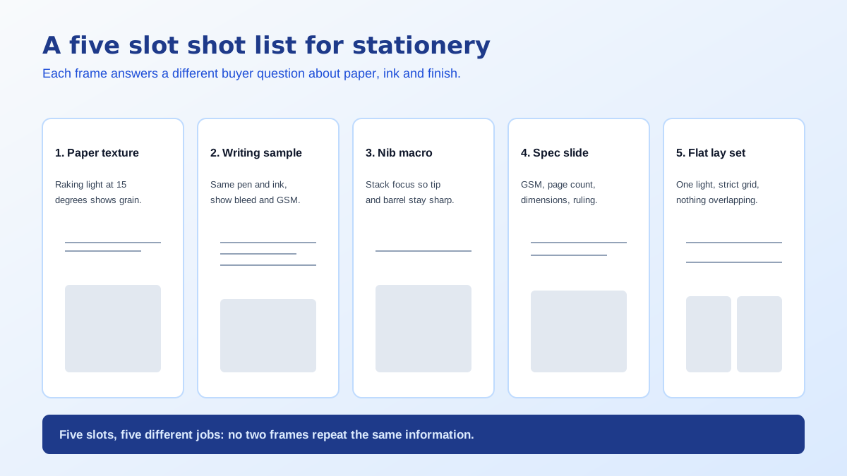
Texture is invisible under frontal light because there are no shadows to describe it. Move the source round until it is nearly parallel to the sheet and every fibre, every laid line and every embossed edge throws a small shadow, which is what converts texture into contrast the camera can record. The effect is dramatic and costs nothing beyond moving a lamp, though it will also reveal every dust particle you were previously getting away with.
Shade matters as much as texture. Cream, ivory and bright white are separate products to a buyer, and automatic white balance will happily render all three as the same neutral. Fix the colour temperature, include a grey card in the first frame, and correct the whole session from it. The broader set of exposure traps behind this is covered in the product photo lighting mistakes guide.
For pens, inks and any paper sold on how it performs, the writing sample is the most important image in the gallery and it is missing from most listings. Write a real line on the actual paper, photograph it square on with even light, and label the nib or tip width. Buyers compare line width, shading and how cleanly the edge holds far more carefully than they compare barrel finishes.
Then photograph the back of the same sheet. Bleed-through and ghosting decide purchases in this category, and a seller confident enough to show the reverse side is making a claim competitors are avoiding. If the paper handles a wet nib without showing through, that single frame is worth more than any adjective in the bullets, and it is an image nobody can dispute in a review.
Close focus on a nib or a mechanism runs into depth of field rather than magnification. At very short distances only a thin slice of the subject is sharp, so a nib shot wide open shows a crisp tip and a blurred shoulder. Brace the camera on a support, use a smaller aperture where the camera allows it, and shoot several frames with the focus point stepped slightly along the subject so you can pick the one that holds.
Keep the angle honest while you are close. A nib photographed from directly above hides the tine gap; from the side it hides the engraving. Two frames answer both, which is a better use of a slot than one clever angle that answers neither. The general principle of assigning one question to each angle is worked through in the product photography angles guide.
Metal parts bring their own difficulty, because a polished barrel or a chrome clip reflects the room rather than having a surface of its own. A bare bulb becomes a hard white streak that hides the engraving underneath it. Bounce the light off a large white card instead, or shoot through a diffusing sheet, so the reflection becomes a broad even band and the lettering stays readable through it.
Paper weight in grams per square metre, page count, ruling type and spacing in millimetres, closed and open dimensions, whether the book lies flat. These are the numbers stationery buyers actually filter on, and they belong on a clean graphic slide where they will be read rather than buried in a bullet that will not. Add a photograph of the book open and flat if it behaves that way, since no cover shot can imply it.
Stationery is frequently sold in sets, and a set photographed as a heap reads as clutter. Lay the components out with even spacing, aligned to a grid, one item deep, so the count is obvious without anybody counting. This flat-lay slot is also where you state what is included, because "12 pens" written across a picture of twelve pens is far more convincing than the same number in a specification table.
Scale still needs its own answer. A pocket notebook and an A4 journal photograph identically when each fills its own frame, so include a hand holding the closed book, or the item beside an object every buyer owns. Marketplaces constrain what the first slot may contain, so plan these frames for the secondary positions, following the rules laid out in the Amazon image requirements guide.
The styled desk scene is what stationery brands spend most of their photography budget on: a window, a linen surface, a cup of coffee, a plant, warm afternoon light. It sells the object as part of a life rather than as an item, and it is exactly the kind of frame that can now be built from one clean source photograph without props or a location. For a small brand releasing a seasonal cover, that removes the largest recurring cost in the calendar, which is the practical argument for AI product photography here.
The detail frames are a different matter and should stay photographic. Ruling spacing, nib engraving, the exact behaviour of an ink line on your specific paper: those are verifiable facts about the product, and a generated approximation of them is a claim you cannot support. Shoot the evidence, generate the atmosphere, and keep the boundary between the two obvious to yourself even when it is invisible to the buyer.
Work through that list and the listing stops competing on price, because it is finally showing the things that justify the price. Good stationery product photography is mostly a decision about crop: everything the buyer is paying for is small, so put it large in its own frame. If you sell into a handmade marketplace, the copy needs the same specificity as the images, and the Etsy listing generator tool handles the tags and description side of that.
Because everything that distinguishes it is smaller than the thumbnail can resolve. Grain, deboss depth, stitch quality and paper shade all live at a scale that disappears when a 2000 pixel file is displayed at 300. The answer is not a sharper camera, it is dedicated crops where the detail fills the frame instead of occupying two percent of it.
Light it from the side, almost parallel to the surface. Raking light casts a tiny shadow off every fibre and every embossed edge, which turns invisible texture into visible contrast. Light from the front does the opposite and flattens the sheet completely, which is why most paper photographs look like a blank grey field.
A real written line at a size a buyer can judge, photographed square on and evenly lit, ideally with the nib or tip size labelled. Include the reverse of the same sheet if bleed-through is a selling point, because that single frame answers the question fountain pen buyers ask most often and few listings bother to answer.
Not necessarily. Modern phone cameras handle close focus well enough for nibs, clips and paper edges, and the harder problem is depth of field rather than magnification. At very close range only a thin slice stays sharp, so brace the camera, stop down if you can, and take several frames at slightly different focus points to pick from.
Put the numbers on a graphic slide rather than relying on the bullets. Grams per square metre, page count, ruling type and spacing, and the flat dimensions of the open book. Support it with a photograph of the book lying open and flat if it does, because that behaviour is a buying reason and cannot be inferred from a closed cover shot.
For staging, yes: a desk, a window seat, a flat lay with props, all built from one clean source photograph, which removes most of the cost of a styled shoot. The detail frames should stay photographic. Nib engraving, ruling spacing and the way an ink line behaves on a specific paper are facts about your product, not a texture to be invented.
ListingRVA AI now works inside Claude. Connect your workspace and ask Claude to generate listing copy and publish product images to your store, without leaving your editor. See the Claude connector →
Comments
No comments yet, be the first.
Leave a comment