
Art Print Photography: Colour Accuracy and Wall Scale
August 17, 2026 · 8 min read · by Aashirvad Kumar
Your credits refresh every month for as long as ListingRVA AI exists. No renewals, no annual increases, nothing to cancel.
Available on select plans. No renewals, ever.
August 17, 2026 · 8 min read · by Aashirvad Kumar
Two messages turn up again and again in a print seller's inbox, and they are not really about the printing. The first says the blue looks grey, or the terracotta looks pink, and asks whether the wrong file was used. The second says the print is much smaller than expected, even though the size was in the title. Both are failures of art print photography rather than failures of production, and both are fixable at the capture stage rather than through a refund policy.
They are separate problems with separate solutions. Colour is a technical chain that leaks accuracy at four different points between the paper and the buyer's screen. Scale is a perceptual problem: a flat crop of an artwork contains no information whatsoever about how big the object is, so the buyer supplies a guess and is later disappointed by it. Getting both right takes one careful copy setup and two extra frames per listing.

A print is one of the few products where the photograph and the product are the same kind of object. With a kettle, an approximate colour is forgivable because the buyer is judging function. With a print, colour is the entire purchase, and a shift of a few percent in hue is the difference between the piece working above a sofa and being sent back. That is why colour complaints on prints are so much higher than the category average, and why they almost never trace back to the printer.
The first leak is the light in your room. Daylight through a window sits around 5500K, a warm bulb around 2700K, and if both are landing on the paper your camera can only neutralise one of them. Worse, the two sources arrive from different angles, so the cast changes across the sheet and one corner of a navy sky reads purple while the other reads green. Switch off everything except one type of light, then photograph a neutral grey card in that same light and set a custom white balance from it rather than trusting automatic.
The second leak is your screen. If your monitor runs warm or bright by default, you will edit the file until it looks right on that screen and thereby push it wrong for everyone else. A calibration device is the proper answer, and the cheap approximation is to compare your edit against the physical print held next to the screen in the same neutral light. Every one of these failures starts with lighting rather than with the camera, which is the same underlying cause behind most product photo lighting mistakes in ecommerce generally.
The copy shot is a solved problem with a specific geometry. Two equal lights, one either side of the artwork, each at roughly 45 degrees to the surface, at matched distance and matched height. That angle sends the specular reflection away from the lens instead of into it, and the matched distance keeps the illumination even so one side of the sheet is not brighter than the other. Check evenness by photographing a blank sheet of the same paper first and looking at the corners.
Keystone is the second half of the geometry. If the camera is even slightly off perpendicular, the rectangle photographs as a trapezoid and the print looks subtly wrong in a way most people cannot name. Put the lens on the centre of the artwork, use the camera's level, and stand further back with a longer focal length rather than close with a wide one, which also removes the barrel distortion that bows straight edges. Gloss surfaces and varnish need more: a polarising filter on the lens plus polarising film over each light kills the sheen that no angle alone can remove.
Glass belongs in the styled photographs, not in the reference one. A framed shot through glazing picks up the room, and unless the frame ships with the order it also sets an expectation you will have to argue about later. Shoot the print bare and flat as the truth frame, then build framed and in-room images separately and label them for what they are. If the frame is not included, put that on the image itself rather than burying it in the description where it is reliably missed.
One more frame earns its place: a raking-light detail shot. Move a single light close to the paper at a shallow angle and the surface texture appears, the tooth of a cotton rag, the deckled edge, the slight relief of heavy ink coverage. That frame is the argument for a print price rather than a poster price, and it is the one buyers zoom into. Deciding which of these views to shoot and in what order is the same planning exercise covered in this product photography angles walkthrough.
Fill the frame with the artwork and you have deleted every clue about size. An A4 print and a metre-wide canvas produce the identical listing thumbnail, so the buyer falls back on whatever the price implies and on the first in-room photo they see. Size is written in the title, in the variant name and in the description, and it still does not register, because reading a number is a different mental act from picturing a wall. The photograph has to do the converting.
The reliable device is a familiar object in the same frame. A three-seat sofa, a console table, a door frame, a bedside lamp or a person are all objects whose size the eye already knows, and they calibrate the print instantly. Hang height matters for believability too: galleries centre work at roughly 145 to 150 centimetres from the floor, and an image that puts the print noticeably higher looks staged in a way that makes viewers distrust the scale as well.
The second device is an explicit comparison graphic. Draw the same wall once, then overlay each size you offer as a labelled outline against a sofa, so the buyer sees that the small one really is small. Sellers who add this frame consistently report fewer wrong-size returns, which is the cheapest conversion work available on a print listing. Images carry more of a purchase decision than the copy does in this category, and the product image conversion statistics give a sense of how lopsided that split usually is.
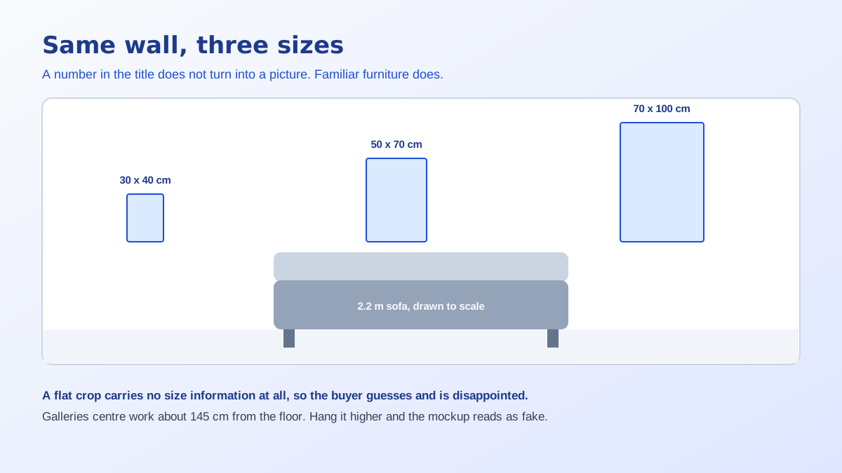
An in-room image is doing three jobs at once and most of them do only one. It has to establish scale against known furniture, it has to place the piece in a style of interior the buyer recognises as theirs, and it has to keep the artwork legible enough that the colours are still readable at thumbnail size. A dramatic room that swallows the print fails the third job, which is why so many beautifully rendered mockups convert worse than a plain wall.
Practical consequence: shoot or generate the room slightly under-decorated. Neutral wall, one piece of recognisable furniture, soft directional light that falls the same way across the print as it does across the room. Keep the artwork occupying a meaningful share of the frame rather than being a stamp in the corner. Sellers listing on marketplaces also need the first image to survive a square crop, and the ordering conventions in this Etsy listing copy generator workflow assume that first frame is doing the hardest work.
Generating rooms around a print solves a genuine problem, because photographing eight sizes in four interiors is a week of work for a catalogue that changes monthly. Staging a wall, choosing furniture and relighting a scene is the same thing a photographer does when hiring a location, and nobody considers that dishonest. The line sits at the artwork: the moment a tool repaints, recolours or reinterprets the print itself, the image has stopped describing what ships.
So keep the flat, colour-managed copy shot as the reference frame and treat it as untouchable, then generate scenes around that exact file. Check the output for the failure modes that matter here, which are colour drift in the artwork, a frame that does not match what you sell, and a size relationship to the furniture that your product does not actually have. Used that way, AI product photography extends a single honest capture into a full set of contexts instead of replacing the capture.
Art print photography rewards a fixed routine far more than it rewards better equipment, because the variables that ruin it are the ones that change silently between sessions. Set the room up once, mark the light positions on the floor with tape, and every print you shoot afterwards is comparable to every other one.
Run that list and the colour complaints stop arriving, because there is no longer a step where the colour can drift unnoticed. The scale complaints stop separately, once the buyer has been shown rather than told how big the piece is. Those are the two questions every print buyer is silently asking, and good art print photography answers both before the description gets a chance to.
Usually white balance rather than the print. If the light hitting the paper is warmer or cooler than what your camera assumed, every colour shifts together, and a shift that small is invisible to you while you shoot because your eyes adapt to the room. Photograph a grey card in the same light, set a custom white balance from it, and the drift disappears.
Place two equal lights at roughly 45 degrees to the surface, one on each side, at the same distance and height so the illumination is even. Glare happens when a light reflects straight back into the lens, and 45 degrees sends that reflection away from the camera instead. For gloss or varnish, add a polarising filter on the lens and polarising film on each light.
Shoot the print unframed and flat as the reference image, because glass introduces reflections and a frame you do not ship can mislead the buyer. Then add framed and in-room images afterwards, clearly labelled as styling. If the frame is not included in the price, say so in the image itself rather than only in the description, where it will be missed.
Give the eye something it already knows the size of. A sofa, a console table, a door frame or a person in the same frame calibrates the print instantly, in a way that a dimension in centimetres does not. Add a separate graphic comparing your sizes against each other on the same wall, since most returns for wrong size come from buyers who never converted the numbers.
Capture far larger than you publish. A copy shot of at least 3000 pixels on the long edge lets a buyer zoom into paper texture and ink detail, which is exactly the evidence that justifies a print price over a poster price. Export to sRGB for the web, because a wider colour space uploaded to a marketplace tends to be rendered flat and desaturated.
Staging a wall, a sofa and the light in a room is normal commercial practice and no different from renting a location. Altering the artwork itself is not, because the image then stops describing what ships. Keep one honest flat copy shot as the reference frame, generate the room scenes around it, and follow the disclosure rules of the marketplace you are selling on.
ListingRVA AI now works inside Claude. Connect your workspace and ask Claude to generate listing copy and publish product images to your store, without leaving your editor. See the Claude connector →
Comments
No comments yet, be the first.
Leave a comment