
Tool Product Photography: Make Size, Thread and Grip Legible
August 14, 2026 · 8 min read · by Aashirvad Kumar
Your credits refresh every month for as long as ListingRVA AI exists. No renewals, no annual increases, nothing to cancel.
Available on select plans. No renewals, ever.
August 14, 2026 · 8 min read · by Aashirvad Kumar
Open the returns report for any hardware catalogue and the reasons cluster in one place. Not faulty, not late, not disliked. Wrong size, wrong fit, does not match my drill, thread is not what I needed. The photographs were sharp and well lit and the product arrived exactly as shown, and it still came back. That is the specific failure tool product photography has to solve, and it is not a failure of image quality.
It happens because a tool is almost never bought on its own merits. It is bought in relation to something the buyer already owns: a drive, a shank, an arbor, a bolt head, a pipe thread, a hand. A listing that shows the tool alone, beautifully, on white, has answered a question nobody was asking. Here is what to photograph instead.
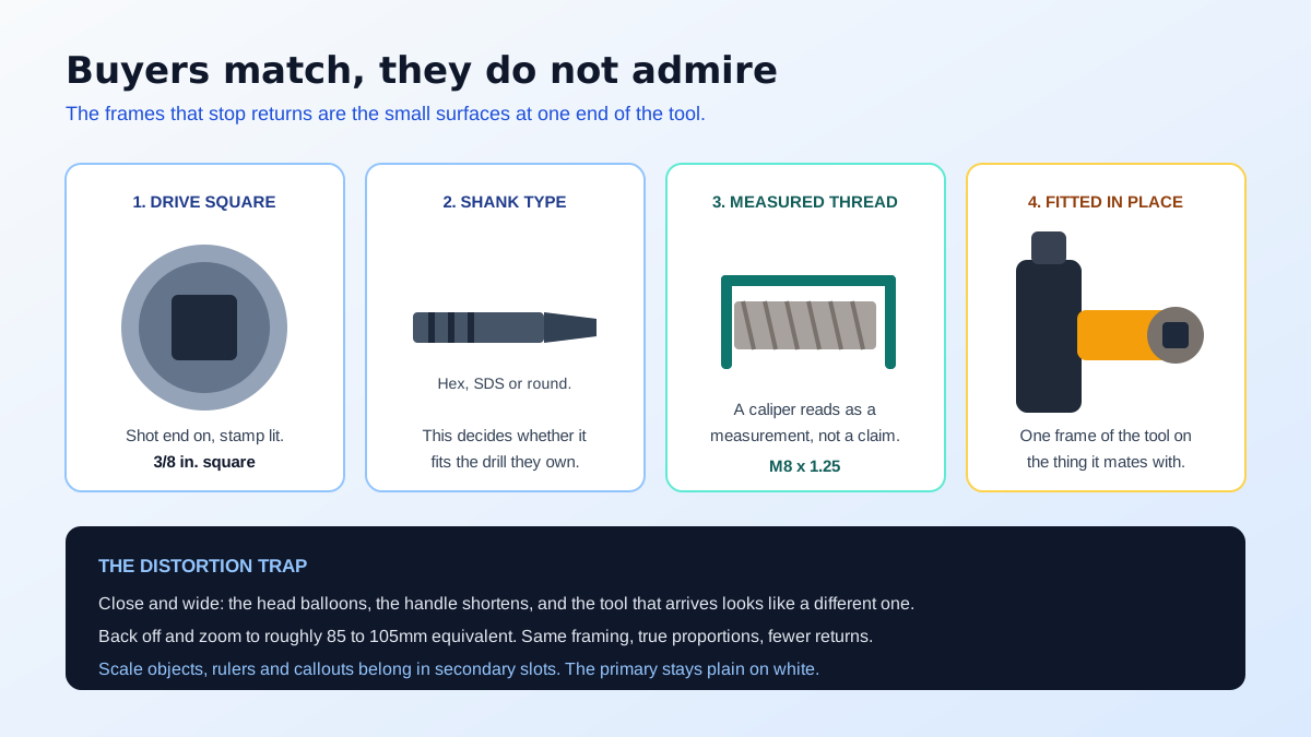
Every tool has one or two surfaces that decide whether it works for the buyer, and they are usually small, usually at one end, and usually the least photogenic part of the item. The square drive on a socket. The hex or SDS shank on a bit. The arbor hole on a blade. The male or female thread on a fitting. The jaw opening on a wrench. Those are the frames that prevent returns, and in most catalogues they simply are not there.
Shoot each interface square on and close, filling the frame, with any stamped marking legible. If the size is cast or laser-etched into the metal, angle a light to catch it rather than flattening it out, because a stamped 3/8 that is readable in the photograph is worth more than the same figure repeated in the bullets. Where a tool mates with common equipment, add one frame of it actually fitted: the socket on the ratchet, the bit in the chuck, the fitting on the pipe. That single image resolves compatibility faster than any amount of text.
Two separate things go wrong with size in tool product photography, and they compound. The first is optical. A short focal length used close to a long object exaggerates whatever is nearest the lens, so a wrench shot from half a metre comes out with an enormous head and a stunted handle, and a screwdriver looks like a different tool from the one in the box. Step back and zoom in instead, somewhere around 85 to 105mm in full frame terms, and the proportions return to true.
The second is contextual. A cutout on white has no scale at all, and the human eye assumes a default size for a familiar shape, which is why buyers order a 150mm plier expecting a 250mm one. Fix it two ways at once: a dimension callout frame with real figures for length, width, jaw capacity and weight, and a physical reference frame with a hand, a ruler or a caliper closed on the part that matters. The caliper version is unusually persuasive, because it reads as a measurement being taken rather than a number being claimed.
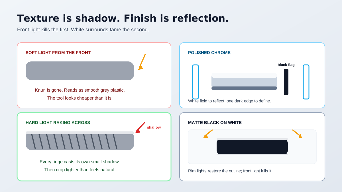
Texture is a shadow phenomenon. Knurling, moulded ribs, diamond patterns and rubber overmould are all visible because their raised parts cast tiny shadows on the parts beside them, and a large soft frontal light removes exactly those shadows. Light a knurled handle the way you would light a bag and it comes out as a plain grey cylinder with a faint pattern printed on it, which is precisely the impression of cheapness you were trying to avoid.
Use a hard, narrow source raking across the surface at a shallow angle, and keep a soft fill on the opposite side so the shadow side does not block up. Then crop tighter than feels comfortable, because a texture that reads clearly at full resolution disappears when the marketplace resizes your frame down to a carousel thumbnail. If the whole product is coming back flat rather than just the texture, the underlying causes are worth reading in this list of product photo lighting mistakes.
Polished chrome behaves like a mirror, so it has no appearance of its own and simply shows the room, including your tripod and your ceiling. Build a white environment around it with large cards or a diffusion panel on both sides so it reflects an even field, then introduce one black card just outside the frame to place a deliberate dark line along an edge. Without that dark line a chrome tool on white loses its outline entirely and reads as a vague silver smear.
Matte black has the opposite problem for the same reason: on a white background, every part of the backdrop is brighter than any part of the tool, so the silhouette dissolves at the edges. More front light makes it worse by washing out the surface. The answer is a narrow source from behind and above on each side, angled to draw a thin bright rim along the outline. Handle both finishes in one session and you will find the setups are close, which matters when a catalogue mixes chromed sockets with black-coated drivers.
Buyers of a 46-piece socket set do something specific with the main image: they count it. If the title says 46 and the photograph shows a jumble in a case with pieces overlapping and two hidden behind the lid, the buyer either abandons or buys and then complains that pieces are missing when they are not. Lay the set out flat and evenly spaced, nothing overlapping, nothing cropped at the frame edge, arranged by size so the progression is obvious.
Where sizes are stamped on the pieces, shoot at a resolution and angle that keeps them legible, and add a second frame with a size table if the range is long. A spec table also belongs in the listing itself rather than only in the imagery, and for Amazon sellers a structured side-by-side of variants can be built quickly with the Amazon comparison chart generator. Sets sold by piece count live or die on whether the buyer can verify that count before paying.
All of the above has to survive contact with the primary image rules. On Amazon and Flipkart the first frame must show the product alone on pure white, filling most of the frame, with no rulers, no hands, no callout text and no props, which means every scale and interface trick in this article belongs in the secondary slots. The exact framing and background thresholds are set out in the Amazon image requirements guide, and they are enforced automatically rather than by appeal.
That constraint is easier to work with than it sounds, because a clean white primary and a set of information-dense secondaries is the right structure anyway. Capture the tool once, properly lit and sharp, then cut it out for the primary with the free background remover tool and build the workbench, garage and in-use context frames from the same source rather than hauling stock to a location. Generated staging works well in this category precisely because the product surface is preserved and only the environment changes, which is the practical case for AI product photography in hardware.
Seven frames, one session, and six of them are answering the question that actually generates your returns. Most hardware carousels currently spend all seven slots on variations of frame one. Rebalancing that is the cheapest available improvement in tool product photography, and unlike a rewrite of the copy you can measure the result directly, because the return reason codes will tell you within a month whether the buyer stopped guessing.
Because the buyer is matching the tool to something they already own, and the listing shows the tool alone. A socket, a bit, a blade or a fitting is only correct in relation to a drive, a shank, an arbor or a thread. If the carousel never shows that interface clearly, the buyer guesses from the title and roughly half the time guesses wrong.
Move back and zoom in. A short focal length used close to a long object exaggerates whatever is nearest the lens, so a wrench photographed from half a metre away comes out with a huge head and a stubby handle. Shoot from further back at a longer focal length, around 85 to 105mm in full frame terms, and the proportions come back true.
In a secondary frame, yes. A caliper closed on a thread or a ruler laid along a shaft is more persuasive than a printed dimension callout, because it reads as a measurement rather than a claim. Keep it out of the primary image, which on Amazon and Flipkart must show the product alone on white with no props.
Separate it with edge light rather than more front light. A black overmoulded grip on a white background loses its outline because the background is brighter than anything on the tool. Add a narrow source from behind and above on each side to draw a bright rim along the edges, and the silhouette returns without washing out the surface.
Rake a hard light across the surface at a shallow angle so knurling, moulded ribs or diamond patterns throw their own small shadows. Frontal soft light flattens texture into a plain grey shape. Then crop far tighter than feels natural, because a texture that is visible at full size is invisible once the frame is resized to a carousel thumbnail.
A countable layout. Buyers of multi-piece sets literally count the pieces in the photograph and compare it against the piece count in the title. Lay every item out flat, evenly spaced, nothing overlapping and nothing cropped at the edge, with sizes legible on each piece where they are stamped.
ListingRVA AI now works inside Claude. Connect your workspace and ask Claude to generate listing copy and publish product images to your store, without leaving your editor. See the Claude connector →
Comments
No comments yet, be the first.
Leave a comment