
Candle Product Photography: Selling Scent and Flame in a Still
August 2, 2026 · 8 min read · by Aashirvad Kumar
Your credits refresh every month for as long as ListingRVA AI exists. No renewals, no annual increases, nothing to cancel.
Available on select plans. No renewals, ever.
August 2, 2026 · 8 min read · by Aashirvad Kumar
A candle is a cylinder. That is genuinely all a camera can see, and it is the central difficulty of candle product photography: the two properties a buyer is actually paying for, the scent and the behaviour of the flame, are either invisible or technically hostile to photograph. Everything else about the product, the glass, the wax colour, the label, is shared with a hundred competing listings that look almost identical in a search grid.
So the job is not documentation, it is translation. You are converting a smell into a visual language and a moving light source into a still frame, and there are specific techniques for both that have nothing to do with buying better equipment.

Buyers do not decode fragrance from a label, they decode it from the world you put around the jar. Two things carry almost all of that signal. The first is raw material: a scatter of cedar shavings, a few dried lavender stems, a split vanilla pod, a cut citrus half placed near the base. These are not decoration, they are the ingredient list rendered as an object, and shoppers read them faster than they read your scent notes.
The second is colour temperature, and it is the more powerful of the two. Amber, tobacco, leather and vanilla want warm low light, deep shadow and a late-evening feel. Citrus, sea salt, eucalyptus and linen want cool bright light, pale surfaces and shallow shadow. Shoot the same jar in both and people will describe the smell differently, which is the entire point. Good candle product photography sets the temperature of the scene to match the note before it worries about anything else.
A live flame is several stops brighter than any surface it lights. Expose so the vessel and label look right and the flame becomes a shapeless white blob with a halo. Expose for the flame and the rest of the frame goes black. This is not a skill problem, it is a dynamic range problem, and the professional answer is to stop trying to solve it in one frame.
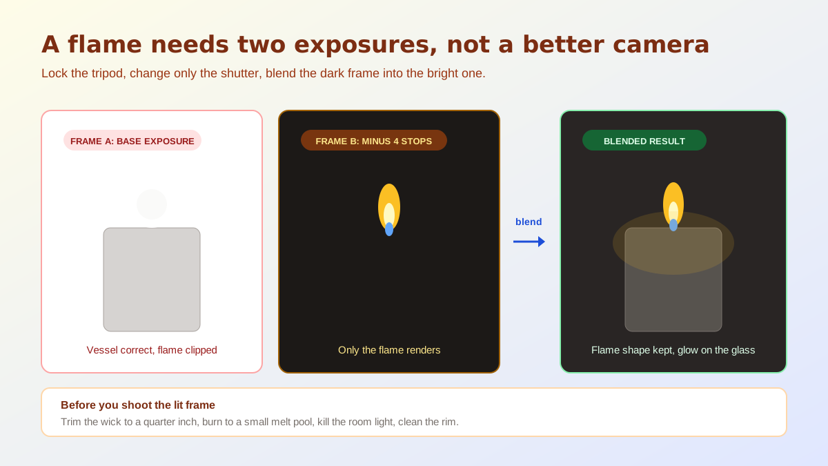
Lock the camera on a tripod and shoot two exposures without moving anything. The first is your base: the vessel, label and surroundings correctly exposed, flame clipped, ignore it. The second is several stops darker, dark enough that the flame renders as an actual teardrop with a blue base and an amber tip and everything else falls to black. Blend the second into the first and you have a frame that no single exposure could produce. Shoot in a room dark enough that the flame contributes visible glow to the vessel, otherwise the lit frame looks the same as the unlit one and there was no reason to take it.
Two practical notes. Trim the wick to roughly a quarter of an inch before shooting or the flame guttering will smear across a long exposure and drop soot on the glass rim, which shows up mercilessly at full zoom. And let a new candle burn long enough to form a small melt pool before you shoot it lit, because a flame sitting on a perfectly flat unburned surface looks composited even when it is not.
A glass vessel has no appearance of its own. Whatever you see on its curve is a reflection of the room, so the only decision available to you is what the room contains. One large diffused source placed well off to the side gives you a single soft vertical highlight that describes the roundness of the jar. A small bare bulb gives you a hard bright spot that reads as cheap, and an overhead ceiling light gives you a smear across the top of the label that no editing pass will remove convincingly.
Black card is the other half of the technique, and it is the part most sellers skip. Placing a black flag just outside the frame on the opposite side from your light puts a dark edge into the glass, which is what separates the vessel from a white background and makes it read as glass rather than as a flat cutout. Frosted and coloured glass need less of it, clear glass needs more. If the highlights on your jars still look harsh after that, the source is almost certainly too small, which is one of the common product lighting mistakes.
Wax deserves its own frame. A soy or coconut blend has a soft matte surface with a visible pour pattern, and a beeswax pillar has an entirely different one, and this is a texture buyers use to judge whether they are getting a craft product or a mass-produced one. Only raking light shows it: put the source almost parallel to the surface and shoot down at a shallow angle. The same principle governs several other matte-surface categories, and the shot list logic in the product photography angles guide transfers directly.
The single highest-value thing in candle product photography is showing the same candle twice, once unlit and once burning, ideally from the same angle. Unlit answers the practical questions: what arrives in the box, how clean the pour is, whether the wick is centred, what the label says. Lit answers the emotional one, which is what this object will do to a room at nine in the evening. Sellers who show only one of the two lose the buyers who needed the other.
Order matters as much as content. On a marketplace the first frame has to be the product alone on a pure white field, unlit, unburned, filling most of the frame, because that image is a compliance asset before it is a marketing one. The atmosphere frame belongs at position two or three where a shopper who is already interested will actually study it. Getting that hierarchy backwards is the most common structural mistake in the category, and it is worth checking against the Amazon product image requirements before you finalise the set.
Scale is the other frequently missed frame. Candles photograph identically at every size, so a 60 gram votive and a 400 gram three-wick look the same in a thumbnail, and the resulting returns are entirely avoidable. A hand holding the jar, or the jar beside a mug or a matchbox on the same surface, settles it in one image. Combine that with the volume and burn time stated plainly in the copy, which an AI product description generator can keep consistent across a whole range of scents.
The unlit hero and the wax texture close-up must come from the real product, because that is what the buyer is being sold and inventing either is dishonest. But the surrounding scenes, the linen-covered side table, the bathroom ledge at dusk, the mantelpiece with a warm glow, are all set dressing that costs a full day to build and shoot for one scent, and multiplies by however many scents you carry. That is exactly the work AI product photography removes from the schedule.
The workflow that holds up: shoot the product honestly on white, shoot the lit blend once for the flame, then generate the atmosphere variants from those real frames so the vessel, label and wax stay exactly what the customer receives. That keeps candle product photography truthful where it must be and cheap where it can be, and it lets a small maker launch eight scents with a full image set each instead of two scents with three frames.
A flame is many stops brighter than everything around it, so a single exposure that renders the vessel correctly will always clip the flame to a white blob. Shoot two frames from a locked tripod, one exposed for the vessel and one exposed several stops darker for the flame alone, then blend the flame frame into the bright one. Nothing else recovers the shape and colour of the flame.
Unlit for the main image on a marketplace, because that frame has to show the product as it arrives: an unburned wick, a clean vessel and a readable label on a plain background. Lit belongs in image two or three, where the flame is doing an emotional job rather than a descriptive one. Buyers want both, in that order.
You show its inputs and its setting. Place a small amount of the actual raw material near the vessel, cedar shavings, dried lavender, a split vanilla pod, and match the colour temperature of the scene to the note: warm and low for amber and tobacco, cool and bright for citrus and sea salt. Buyers translate those cues into a smell surprisingly reliably.
Glass has no appearance of its own, it only shows you the room. Small hard sources become bright distracting spots on the curve of the jar. Use one large diffused source placed off to the side, then flag the areas you do not want reflected with black card so the glass reads as glass rather than as a mirror of your kitchen.
Pure white for the compliance frame, then a textured neutral surface for everything else. Stone, raw plaster, linen and pale timber all read as calm and expensive and none of them compete with the vessel. Avoid busy patterns, because a candle is a simple shape and clutter around it makes the product look smaller than it is.
Put it next to something whose size nobody has to guess at. A hand holding the jar, a matchbox, a coffee cup or a book on the same surface communicates volume instantly, and it prevents the most common candle return, which is a buyer expecting a large three-wick and receiving a small votive that photographed identically.
ListingRVA AI now works inside Claude. Connect your workspace and ask Claude to generate listing copy and publish product images to your store, without leaving your editor. See the Claude connector →
Comments
No comments yet, be the first.
Leave a comment