
Coffee Packaging Photography: Make a Soft Bag Stand and Read
August 4, 2026 · 8 min read · by Aashirvad Kumar
Your credits refresh every month for as long as ListingRVA AI exists. No renewals, no annual increases, nothing to cancel.
Available on select plans. No renewals, ever.
August 4, 2026 · 8 min read · by Aashirvad Kumar
You stand the bag up, step back, and it leans. You prop it, and now the front panel has a diagonal crease running through the roast name. You fill it properly and it puffs into a pillow with the seams bulging, so the label curves away from the lens and the origin text goes soft at the edges. Coffee packaging photography has this problem before it has any other problem, because the product is a soft object pretending to be a rigid one.
The second problem arrives immediately after: the material. Coffee is sold in matte film, gloss film and metallised foil, and each of the three misbehaves in a different direction under the same light. What follows is the practical fix for both, plus the frames that stop refund requests on roast and grind.
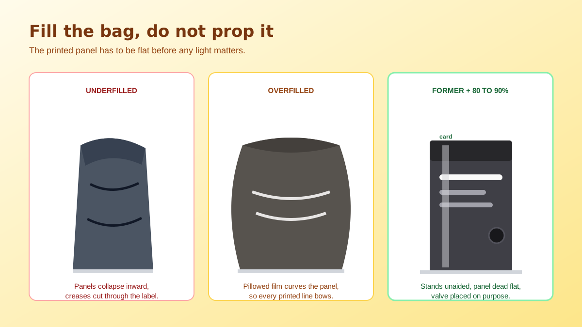
A stand-up pouch is engineered to hold its form when it is full of roasted beans and sitting on a shelf, not when it holds two hundred grams and is standing on a sweep in your kitchen. Underfilled, the front and back panels collapse towards each other and the whole thing folds forward from the gusset. Overfilled, the film stretches into a rounded pillow, the printed panel becomes a curved surface, and every horizontal line on the label bows.
The fix is an internal former. Cut foam board or stiff card to the internal width and depth of the bag, a few centimetres shorter than the fill line, and slide it in flat against the front panel. Pack around it with rice, filler beans or the actual product until the bag reaches roughly eighty to ninety percent of its volume, then close the tin tie or press the zipper. The former keeps the printed panel dead flat while the fill gives the bag weight, and the result stands on its own with no support behind it.
Film remembers everything. A bag that has been shipped folded carries a permanent crease, and a crease across a printed panel reads on camera as a manufacturing fault rather than as handling. Store shoot stock flat and unopened, and if a crease is already there, work it out gently with your palm over a warm surface rather than pointing anything hot directly at foil, which distorts and blisters far faster than you expect.
Metallised and gloss bags take fingerprints on contact, and the marks are invisible in the room and glaring on camera because your light is raking across them. Handle shoot stock with cotton gloves or by the seams only, and wipe down with a dry microfiber immediately before the frame. Watch the degassing valve as well: it is a small dark disc on an otherwise clean panel, and the eye goes straight to it, so decide where it sits in the composition rather than letting it land wherever the bag was filled.
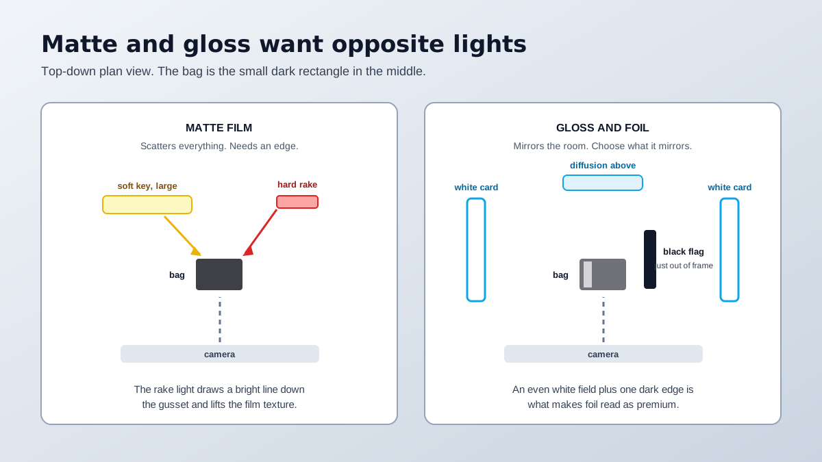
Matte film scatters incoming light in all directions. That makes it forgiving, but it also means a single large soft source gives you nothing: no sheen, no edge, no separation, and the bag sinks into a light background as a flat brown rectangle. The correction is a second, narrower and harder source raking from behind and to one side, angled so it grazes the surface. That produces a defined bright edge down the bag and brings up the texture of the film without creating a hotspot on the label.
Gloss and metallised film is the opposite case. It has no appearance of its own, so whatever is in front of it is what you photograph, including you, your tripod and your ceiling. The working method is to build a white environment: large white cards or a diffusion panel on both sides so the bag mirrors an even field, and then a single black card just outside the frame to place a controlled dark edge that separates the bag from the backdrop. That black edge is what makes foil look expensive instead of chaotic. If the reflections are still fighting you, the underlying principles are covered in more depth in this breakdown of product photo lighting mistakes.
Everything above gets you an attractive sealed bag, and a sealed bag conveys almost no information about coffee. The buyer wants to know two things your packaging photograph cannot show: how dark the roast is and how coarse the grind is. Those are the two attributes that generate the most disappointed messages, because a customer who ordered a medium roast and received something that looks black in the cup will say so.
So build a reveal frame. Either open the bag and shoot down into the mouth with beans filling it, or arrange a small controlled spill in front of a standing bag using a scoop rather than tipping. For ground coffee, put a spoon in the frame, because grind coarseness is meaningless without a scale reference and a macro shot of ground coffee with nothing beside it could be anything from espresso to French press. Shooting the object from more than one distance is a general rule, and the reasoning behind it is set out in this guide to product photography angles.
Roast level lives in a narrow band of browns, from a pale cinnamon through to a near-black oily surface, and the visual difference between one step and the next is small. A colour cast that would be unnoticeable on a blue product moves a medium roast a full step in either direction. That is a real commercial problem, not an aesthetic one, because roast level is the attribute the buyer chose on.
The discipline is the same one that fixes most colour complaints. Kill every light in the room except one type, so daylight and tungsten are never mixing on the same surface. Set white balance from a grey card photographed in the same light rather than trusting automatic, which will try to neutralise the brown itself. Then check the result against the actual beans in daylight before you publish. Coffee packaging photography that gets the bag beautiful and the roast wrong has solved the easy half of the job.
Grocery and consumable listings carry an extra obligation that a homeware listing does not. Buyers cannot pick the bag up and turn it over, so the label copy has to be readable somewhere in the carousel: origin, process, roast, net weight, and any allergen or ingredient statement your market requires. Shoot that panel square to the lens with the bag flat, not at an angle, so the text stays sharp from corner to corner and survives being resized down to a thumbnail. The framing and background rules for the primary slot are laid out in the Amazon image requirements guide.
The rest of the carousel is where a small roaster wins or loses. A grinder mid-pour, a cup on a counter, a subscription pack of three bags in a row: those frames make the brand feel like a brand rather than a white-label bag. Cutting the sealed bag out cleanly for the primary slot is a one-click job with the free background remover tool, and the same well shaped, well lit capture can then be restaged into kitchen and cafe contexts instead of booking a location. That is the practical case for AI product photography in a category where the packaging is the product.
That is six frames from a single session, and only the first two need the former and the careful fill. Work in that order and the expensive part, which is shaping and lighting the bag, happens once. Everything after it is a variation on a capture you have already got right, which is the whole efficiency argument in coffee packaging photography for a small roaster with a large SKU count and one afternoon.
Fill it rather than prop it. Cut a piece of foam or stiff card to the internal width and depth of the bag, slide it in against the front panel, then pack rice or spare beans around it until the bag sits square. A bag filled to roughly eighty to ninety percent of its volume holds its shape without pillowing at the seams.
Matte film scatters light in every direction, so a single soft source produces no sheen and no edge, and the bag merges into the background. Add a narrow hard light raking across the surface from behind and to one side. It puts a defined bright edge on the bag and reveals the texture of the material without creating a hotspot.
A gloss or metallised bag has no appearance of its own, so you are choosing what it reflects rather than removing reflections. Surround it with large white surfaces so it mirrors an even white field, then place a black card just outside the frame to create a controlled dark edge that separates the bag from the background.
In at least one frame, yes. A sealed bag tells the buyer nothing about roast level or grind size, which are the two attributes most likely to cause a refund request. A small controlled spill or an open bag with beans visible at the mouth settles both, and a spoon in the frame gives a scale reference for grind coarseness.
Roast colour sits in a narrow band of browns, so a small colour cast shifts a medium roast into looking dark or a light roast into looking under-roasted. Shoot under a single colour temperature with every other light switched off, and set white balance from a grey card in the same light rather than trusting the automatic setting.
For grocery and consumable listings you should plan on it. Marketplaces expect a legible frame of the label copy, including origin, roast, weight and any allergen or ingredient statement, and shoppers use it as a substitute for turning the bag over in a shop. Shoot it square to the lens so the text stays sharp corner to corner.
ListingRVA AI now works inside Claude. Connect your workspace and ask Claude to generate listing copy and publish product images to your store, without leaving your editor. See the Claude connector →
Comments
No comments yet, be the first.
Leave a comment