
Lifestyle vs White Background: Which Image Belongs in Which Slot
July 30, 2026 · 8 min read · by Aashirvad Kumar
Your credits refresh every month for as long as ListingRVA AI exists. No renewals, no annual increases, nothing to cancel.
Available on select plans. No renewals, ever.
July 30, 2026 · 8 min read · by Aashirvad Kumar
You have seven image slots and one product. Slot one is settled because the marketplace decides it for you, and after that it is guesswork. Another angle on white. A hand holding the thing. The product sitting on a kitchen counter that is not your kitchen. Most sellers fill the remaining slots with whatever they happened to shoot, and the lifestyle vs white background argument gets treated as a matter of taste.
It is not a matter of taste. Each slot is being asked a specific question by a buyer who is scrolling fast, and the two image types answer completely different questions. Put the wrong type in a slot and that question stays unanswered until the buyer either scrolls to the reviews to find the answer or leaves. This is a slot-by-slot map of which type goes where and why.
A white background frame is an identification image. It strips away everything except the object so the eye can read its shape, proportion, finish and colour without interference. That is why marketplaces mandate it for the primary slot: a grid of search results is only comparable if every product is presented the same way. It also functions as a trust signal, because a clean cutout tells a buyer that a real seller photographed a real unit rather than screenshotting a supplier catalogue.
A lifestyle frame does none of that. It is bad at showing exact colour, because the surrounding scene casts light onto the product and biases perception. It is bad at showing shape, because a chair viewed inside a room is partly obscured by the room. What it is unbeatable at is scale, use and desire. A buyer cannot judge how large a 30 centimetre planter is from a cutout floating in white space, and no amount of dimension text in the bullets fixes that as quickly as one photo of the same planter next to a sofa.
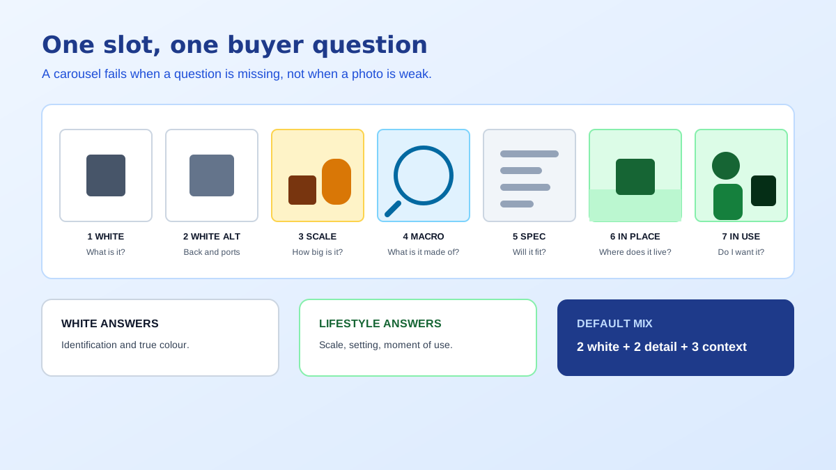
Strip the debate back and there are four things a buyer needs settled before they will commit. What exactly is this object. How big is it in my hands or my room. What is it made of and how well is it made. What does owning it look like. Each of those maps to an image type, and the reason a carousel underperforms is almost always that one of the four is missing entirely rather than that any individual photo is weak.
The first question belongs to white. The second belongs to lifestyle or to an explicit scale frame with a known reference object. The third belongs to macro detail, shot close enough that a stitch, a weld, a grain or a coating is legible at thumbnail size. The fourth belongs to lifestyle again, but a different kind: the aspirational frame, the one that is styled rather than explanatory. Sellers who understand the lifestyle vs white background split usually still fail here, because they shoot four versions of question four and none of question three.
For a standard seven-slot Amazon carousel, the arrangement below covers all four questions with no wasted frames. Slot one is a pure white cutout, product filling most of the frame, no props and no text, because the platform will suppress anything else. Slot two is the primary alternate angle, still on white, usually the back or the side that carries the controls, the port, the label or the closure. Slot three is a scale frame: the product held, worn or placed beside something universally recognisable.
Slot four is a macro detail on the single material property the product is sold on, whether that is the weave, the machining, the seal or the finish. Slot five is a specification or infographic frame carrying dimensions, capacity and what is in the box. Slots six and seven are lifestyle: the product in its natural setting, ideally one indoor and one showing the moment of use rather than the object at rest. Nothing in that sequence is decorative, which is the test to apply to any frame you are unsure about.
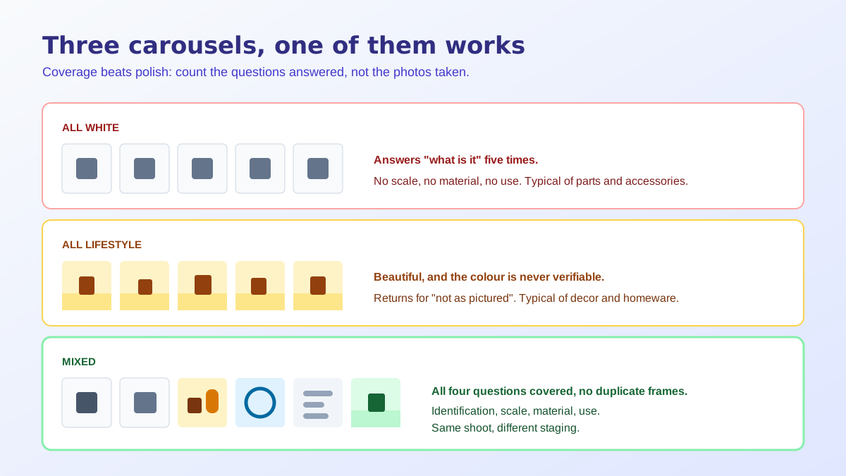
The failure pattern splits neatly by category. Sellers of considered, tactile goods (furniture, apparel, homeware, decor) drift towards all lifestyle, ending up with seven beautiful room scenes and no frame that shows the product plainly. The buyer never learns the actual colour, and the return rate tells them so. Sellers of technical goods (components, tools, electronics accessories) drift the other way and produce seven near-identical white cutouts rotated a few degrees apart, which answers question one seven times and questions two through four never.
A working default is one white main, one white alternate, two detail or specification frames, and three in-context frames. Shift towards context for anything bought on fit, feel or aesthetics. Shift towards white and macro for anything bought on specification, where the buyer already knows what they want and is checking compatibility. Images carry more of the decision than the copy does on almost every category, and the product image conversion statistics give a sense of how much weight that carousel is actually holding.
The slot map above assumes Amazon, where the primary image must sit on pure white with the product occupying most of the frame and with no borders, watermarks, text or additional props. Flipkart applies a comparable rule and runs an automated quality check against it before the listing goes live, so the first frame is effectively fixed on both. The precise pixel and framing limits differ enough to matter, and the Amazon image requirements guide lists them field by field.
Etsy and most Shopify themes are the opposite case. Nothing forces a white first image, and because so many competing shops default to plain cutouts, a styled in-context frame is often what earns the click from the grid. Etsy in particular rewards a first photo with atmosphere, which is covered in more depth in these Etsy product photography tips. On Shopify the constraint is layout rather than policy, since your theme crops to a fixed aspect ratio, and the Shopify product image size reference explains where those crops fall.
The old reason for choosing sides in the lifestyle vs white background question was cost. A white set and a styled location shoot are two different days, two different setups and often two different photographers, so small sellers picked one and lived with the gap. That constraint is mostly gone. A single clean capture on a plain surface, correctly exposed and sharply focused, can be cut out for the white frames and restaged into as many contexts as the carousel needs, because the product pixels are preserved while only the surroundings change.
The practical workflow is to shoot for the white frames and generate the rest. Get the product square to the lens, lit softly, with the background clipping cleanly so the cutout is trivial. From there the plain frames come from the free background remover tool and the context frames come from generation. What none of it can do is invent detail that was never recorded, so a soft or badly exposed source limits everything downstream. That division of labour is the honest argument for AI product photography in a listing workflow.
Run that audit across your top ten listings and the pattern will be consistent rather than random, because carousels are usually built by one person with one instinct. Whichever direction you lean, the correction is the same: the lifestyle vs white background split is not a preference to defend, it is a checklist of buyer questions to cover. Fill the gaps first, improve the individual photos second, and rebuild the whole set only when the product itself changes.
Neither is better in isolation, because they answer different questions. A white background frame answers what the object is and whether the listing is legitimate. A lifestyle frame answers how big it is, where it lives and whether the buyer wants it. A carousel that runs entirely on one type leaves half the buying decision unanswered.
No. Amazon requires the main image to sit on a pure white background with the product occupying the majority of the frame, and with no props, text, logos or borders. A lifestyle photo in that slot risks the listing being suppressed. Lifestyle belongs in the secondary slots, where props and context are permitted.
A useful default for a seven-slot carousel is one white main, two detail or specification frames, and three or four in-context frames. Products bought on fit or feel lean further towards context. Products bought on specification, such as spare parts or components, lean further towards white and macro detail.
Only when they are shot for a full-width web hero rather than a thumbnail. On a phone the carousel frame is small, so a wide room scene with the product sitting somewhere in it reads as an empty photo. Crop lifestyle frames tighter than feels natural on a desktop screen and the problem disappears.
No. Amazon and Flipkart both enforce a white primary image, so the mix starts from a fixed point. Etsy and most Shopify themes let the first image be anything, and a styled in-context frame usually earns more clicks there because the surrounding grid is full of similar plain cutouts.
Not any more. One clean, well exposed, well focused capture on a plain surface can be restaged into multiple contexts, because the product pixels are preserved and only the surroundings are generated. What cannot be recovered is detail that was never captured, so the source frame still has to be sharp and correctly exposed.
ListingRVA AI now works inside Claude. Connect your workspace and ask Claude to generate listing copy and publish product images to your store, without leaving your editor. See the Claude connector →
Comments
No comments yet, be the first.
Leave a comment