
How Many Product Images Do You Actually Need?
August 1, 2026 · 8 min read · by Aashirvad Kumar
Your credits refresh every month for as long as ListingRVA AI exists. No renewals, no annual increases, nothing to cancel.
Available on select plans. No renewals, ever.
August 1, 2026 · 8 min read · by Aashirvad Kumar
Open almost any small-seller catalogue and the pattern is the same: a front shot, a back shot, and one taken at an angle. Three images, and then the listing stops. Ask how many product images a listing should have and most sellers answer with whatever they happened to shoot on the day, which is why the same three-photo gallery appears across thousands of listings that have nothing else in common.
Three is not a considered number. It is the number you get when photography feels expensive and each extra shot means another setup, another edit, another upload. The problem is that a gallery is not a record of what you photographed, it is a sequence of answers, and a buyer standing in a shop would ask far more than three questions before paying.
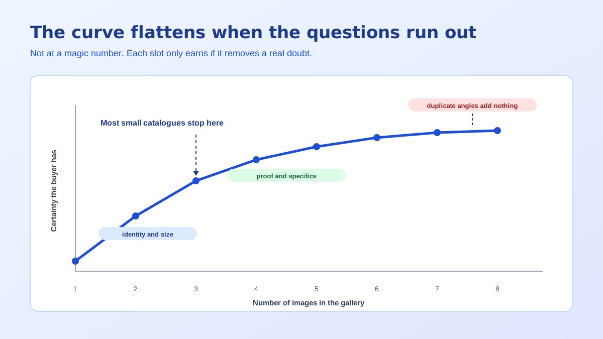
Adding images does not lift conversion because there are more of them. It lifts conversion because each one removes a specific piece of uncertainty, and uncertainty is what stops a purchase. That distinction matters, because a seller who chases a number ends up uploading the same object photographed from eight barely different angles, which removes no uncertainty at all and makes the gallery feel padded.
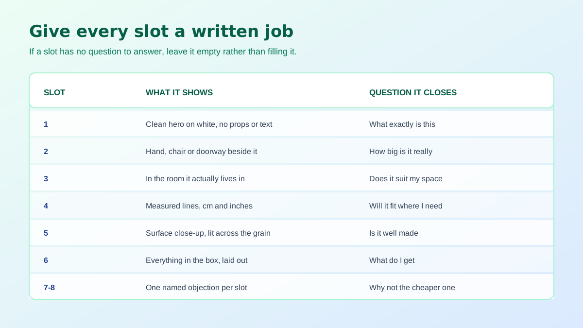
Run the test the other way round. Write down every question a buyer would ask if the product were on a table in front of them: how big, what is it made of, how does it work, what comes in the box, how does it look in a real room, what does the finish look like up close, how does it compare with the cheaper version. That list is your gallery. If it has seven entries you need seven images, and the eighth would be filler.
The shape of the curve is consistent even though the exact numbers differ by category and by data source. Going from one image to three is a large gain, because the first three carry the most basic information. Three to six is a smaller but real gain, since these are the slots that handle scale, use and material. After roughly seven the line goes nearly flat, not because seven is magic but because a typical product has run out of genuinely new questions by then.
Complex or high-consideration products push the flattening point further out. Furniture, electronics with ports and compatibility, anything assembled, anything sized: these keep earning from slot eight and nine because they still have unanswered questions. A plain consumable in a familiar format saturates at four. Images are doing more of the persuasion than most sellers assume, and the product image conversion statistics are worth reading before deciding your own ceiling.
Slot one is the clean hero, and on Amazon it is tightly constrained: product alone, pure white background, no props, no text, no logos, filling about 85 percent of the frame. Slot two should almost always be scale, because size is the most common pre-purchase question and the most common reason a return is filed. A hand, a chair, a doorway, a countertop: any object the buyer already knows the size of will do the job.
Slot three is the product in use or in context, which is where the buyer decides whether it belongs in their life rather than merely whether it exists. Note that only the first slot is rule-bound in that way, and the constraints differ between marketplaces, so it is worth checking the specifics before assuming what is allowed. The Amazon side is laid out field by field in the Amazon image requirements guide.
These are the slots most catalogues skip, and they are the ones that convert the hesitant shopper. A dimension slide with measured lines in centimetres and inches. A close detail shot lit across the surface so texture, stitching or machining reads clearly. A what-is-in-the-box layout, which is the single most effective way to stop the message asking whether the cable, the mount or the spare filter is included.
Each of these has to survive a thumbnail, because that is where the first glance happens. Type smaller than about 4 percent of the image height disappears on a phone, so a dimension slide crowded with six labels is a slide nobody reads. One idea per image, stated large. If a slot needs two ideas, it needs two slots, and you almost certainly have the room.
There is an ordering effect here too. Shoppers on a phone swipe through the first few frames and stop, so a proof slot buried at position eight is effectively invisible even though it exists. If your data says size is the question that kills the sale, the size image belongs at two, not at six. Order the gallery by how often the question gets asked, not by how the shoot happened to run.
The last slots handle whatever specific doubt keeps your product in the basket without being bought. A comparison against the variant one size up. A durability or care note. An installation sequence in three frames. A second lifestyle context for a product that sells into two different rooms. These are worth building only when you can name the objection, and if you cannot name it, stop at six and spend the effort elsewhere.
The reliable method is not benchmarking against a competitor gallery, because you cannot see whether theirs works. It is reading your customer questions, your three-star reviews and your return reasons. Every recurring question is a missing image, named for you by someone who looked at your listing and left without buying. Ten minutes in that data usually produces a more accurate gallery plan than an afternoon of analysis.
Cap information is easy to find and rarely the limit anyway. Amazon accepts up to nine images per listing, Etsy allows ten photographs plus a video, and Shopify has no practical ceiling. Almost no small catalogue is bumping against those numbers. The constraint has always been production cost, which is exactly the constraint that changed. Tightening the listing text at the same time is worth doing, and the Amazon listing optimization tool covers the copy side of the same audit.
Every argument for stopping at three was an argument about production. A lifestyle scene meant a location, a props budget and a day. A seasonal variant meant reshooting the whole set. Under those conditions three images was a rational compromise, and most catalogues were built under exactly those conditions, which is why the thin galleries cluster on older products.
That cost structure no longer holds. One clean source photograph can now be restaged into a kitchen, a desk, a garden or a gift table, and a dimension slide or a contents layout is a graphic rather than a shoot. The remaining work is deciding what each slot should say, which was always the part that mattered. That shift in where the effort goes is the real argument for AI product photography rather than the novelty of it.
One caution comes with that. A gallery built from generated frames still has to describe a real object, so the proportions, the colour and the visible features have to match what ships. A restaged scene that quietly slims a bulky item or brightens a colour will convert better and return worse, which is a trade nobody wants. Treat generation as staging, not as retouching the product itself, and the extra slots are pure gain.
It is also worth auditing what you already have before producing anything new. Most catalogues contain usable frames that were never uploaded: an angle from an old shoot, a packaging photo taken for a supplier, a detail shot cropped out of a wider image. Filling three empty slots from an existing folder costs nothing and is usually the fastest improvement available on a listing that is already receiving traffic.
Apply that to your ten highest-traffic listings before touching anything else, because those are the pages already receiving the visitors you are currently losing. Deciding how many product images a listing needs stops being a guess once every slot has a written job, and the empty slots at the end are a feature: they tell you that you ran out of questions rather than out of budget. Consistency across the finished set matters as much as the count, which the product photography angles guide gets into.
Enough to answer every question a buyer would ask if they were holding the item, which for most physical products lands between six and eight. The count is a symptom, not a target. If you can name eight distinct questions your product raises, you need eight images, and if you can only name five, the sixth will be a duplicate angle that adds nothing.
Amazon accepts up to nine images on a listing, including the main image, though how many are shown before a shopper has to click varies by device and category. Etsy allows ten photos plus a video. Shopify has no practical limit. The cap is rarely the constraint, since most listings never come close to it.
No. The gain comes from removing uncertainty, not from volume. Three images that answer size, use and material outperform eight that are all the same object rotated slightly. Once every real question is covered, extra slots stop moving anything, and near-identical angles can even slow a shopper down by making the gallery feel repetitive.
The scale image, in almost every category. Size is the single most common pre-purchase question and the most common reason a return gets filed, because a listing photo has no inherent size and shoppers rarely convert stated dimensions into a mental picture. Put a hand, a room or a familiar object in the second slot and a large class of questions disappears.
Read your own customer questions, your one-star and three-star reviews, and your return reasons. Every recurring question is an image that does not exist yet. This is faster and more accurate than copying a competitor gallery, because it is drawn from people who looked at your specific product and did not get what they needed.
Usually yes, and it is normally cheaper than any other optimisation available. Older listings tend to have the thinnest galleries because they were created when photography was expensive, while they often carry the review history that makes traffic worth converting. Start with the products that already get views and lose them.
ListingRVA AI now works inside Claude. Connect your workspace and ask Claude to generate listing copy and publish product images to your store, without leaving your editor. See the Claude connector →
Comments
No comments yet, be the first.
Leave a comment