
Etsy Listing Photo Order: What Belongs in Each of the Ten Slots
August 14, 2026 · 8 min read · by Aashirvad Kumar
Your credits refresh every month for as long as ListingRVA AI exists. No renewals, no annual increases, nothing to cancel.
Available on select plans. No renewals, ever.
August 14, 2026 · 8 min read · by Aashirvad Kumar
Open ten listings in your category and count how many use the second, third and fourth photo to show the same object from a slightly different angle. It will be most of them. The shop spent a day shooting, filled every slot, and still left the buyer holding the same three questions they had before they swiped. That is what a bad etsy listing photo order looks like: not missing photos, just photos that repeat each other while the actual objections go unanswered.
Etsy gives you ten image slots and a video slot per listing. They are not ten chances to show the product, they are ten answers, and the sequence is the argument. The first slot decides whether anyone arrives, the next two decide whether they stay, and the last few exist to remove the specific doubt that would otherwise send someone back to search.
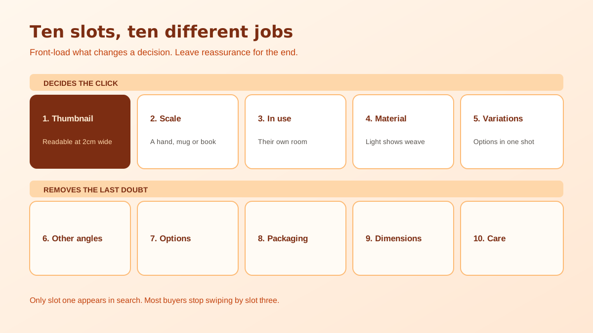
Two behaviours make the sequence matter. The first is that only one image ever appears in search results, so slot one is competing against every other thumbnail in the grid while the other nine are invisible. The second is that swiping stops early. Buyers move through the first few images quickly and then either commit to reading or leave, which means slots two and three carry most of the persuasion and slot nine is only ever seen by someone already close to buying.
That produces a simple rule for the whole sequence: front-load the information that changes a decision, and put the reassurance later. Scale, use and material change decisions. Packaging, care instructions and dimension diagrams reassure someone who has already decided in principle. Shops that invert this, opening with three artful flat lays and hiding the in-use photo at slot eight, lose people who never got far enough to see the thing that would have convinced them.
The first image is displayed at two very different sizes and you only control one of them. In search results on a phone it can be a couple of centimetres across, and at that size the only things that survive are shape, contrast and colour. Fine texture, small text, subtle styling and any prop smaller than the product itself all disappear. A photograph that looks best at full width on a laptop can be genuinely unreadable in the grid, which is where the click is actually won or lost.
So shoot slot one to be legible when small: the whole product filling the frame with clean margins, one clear silhouette, strong separation from the background, and no more than one supporting prop. Etsy also crops the first image differently in different placements, so square originals with breathing room at the edges survive better than tight horizontal crops. Shoot at least 2000 pixels on the shortest side, because Etsy generates its own downsized versions and cannot invent detail you never uploaded.
Check the result honestly by shrinking it. Put the candidate images side by side at thumbnail size next to real competitor listings from your own category, and pick the one that still reads. This takes ten minutes and is more predictive than any amount of judgement at full resolution, and the wider set of shot-planning decisions behind it is in the product photography angle checklist.
These two answer the questions that cause the most abandoned carts on Etsy, which are how big is it really and what does it look like in a real space. A scale photo needs a reference the buyer already knows: a hand, a mug, a book, a doorway. A use photo needs the product doing its job in a room that resembles the buyer's room rather than a studio. Handmade categories lose more sales to misjudged size than to price, and these are the two slots that fix it. If you only have the budget of attention for two extra photographs in the whole listing, spend it here. A ring that turns out chunkier than expected, a print that is smaller than the frame the buyer already owns, a bowl that will not hold what they planned: every one of those is a return, a refund conversation and usually a lukewarm review, and every one of them is preventable with a single well-composed frame.
Slot four is the close-up that proves the making: the weave, the grain, the glaze, the stitch, the join. This is the photograph that separates a handmade listing from a dropshipped one, and it needs raking light rather than flat light so the surface has depth. Slot five shows every variation you offer in a single frame, because a buyer choosing between four colours wants to compare them together rather than by tapping through a dropdown. Keep that frame consistent in lighting and background, because a variation grid where each item was photographed on a different day and a different surface makes the colours impossible to compare, which is the exact opposite of the job it was placed there to do.
Now the conventional angles earn their place: the back, the underside, the interior, the closure, whatever a buyer would turn over if the item were in their hands. If your listing offers personalisation, slot seven is where the examples belong, showing the same product with three genuinely different customisations so the option feels real rather than theoretical. Apparel and accessory shops often use this pair for fit, where a ghost mannequin photography approach shows shape without putting a model in every frame.
The last three are reassurance and they punch above their weight for gifting, which is a large share of Etsy volume. Show the packaging as it will arrive, because a buyer sending a present needs to know it will not turn up in a bare polymailer. Put a dimension diagram with real measurements in the ninth slot, and use the tenth for care instructions or what is included. Anything you cannot fill with new information should be left empty rather than padded with another angle.
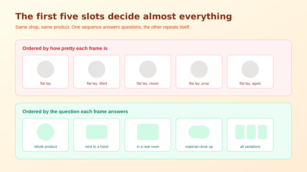
The usual cause is that the photos are ordered by how good they look rather than by what they do. The prettiest frame goes first, the second prettiest goes second, and the plain informative shots get pushed to the end because they are less flattering. That is a gallery running order, not a sales one. The photograph that answers a question is worth more in slot three than a better-looking photograph that answers nothing.
The second cause is that the informative shots are harder to produce. A scale reference needs a second object and a considered composition, a variation frame needs every version in stock at the same time, and a room-context shot needs a room that suits the product. Restaging existing shots into contexts you do not physically have is one of the more practical uses of AI product photography for a small shop, with the caveat that Etsy has been tightening what counts as an AI-assisted image, which the Etsy AI disclosure rules piece covers before you publish anything generated.
There is a third cause that is easier to fix than either: nobody ever looks at the listing the way a buyer does. Open your own shop on a phone, in a browser you are not signed into, and go through the sequence at the speed you would give a stranger's listing. Swipe twice and stop, then ask yourself what you still do not know about the product. Whatever comes to mind is what belongs in slot two or three, and it is almost never the frame currently sitting there. Doing this once per listing catches more problems than any checklist, because it tests the sequence rather than the individual photographs.
Set that up once and a new listing takes a fraction of the time, because the etsy listing photo order becomes a template rather than a decision you make from scratch each time. It also makes the written side easier, since the questions you answered in images are the same ones the description and tags should cover, and the Etsy listing generator tool builds that copy from the same product details. Images carry more of the outcome than most sellers expect, and the product image conversion statistics put a number on how much.
Yes, for two separate reasons. The first image is the only one that appears in search results, so it carries the entire click. After that, most buyers swipe two or three images before deciding, so whatever sits in slots two and three is doing the persuading and everything past slot five is only read by people who are already interested.
Use all ten if you can fill them with genuinely different information. Ten near-identical angles is worse than six photos that each answer a different question, because repeats train the buyer to stop swiping. If you run out of real information at slot seven, stop there rather than padding.
Etsy recommends at least 2000 pixels on the shortest side, and shooting square gives you the most freedom because the thumbnail crop and the listing page display are not identical. Upload larger than you think you need, since Etsy generates its own smaller versions and an undersized original cannot be recovered later.
The one that is still readable at the size of a search result thumbnail on a phone. That usually means the whole product filling the frame with generous margins, minimal props and strong contrast against the background. A beautiful styled scene that becomes unreadable when shrunk is the single most common first-slot mistake.
Etsy expects sellers to be transparent about how listing imagery was produced, and enforcement has widened to include edits that sellers previously treated as routine retouching. Check the current policy before you publish, because the practical risk is not a warning but a quiet removal of the listing.
Both. Put the measurements in the description so they are searchable and readable by assistive technology, and put them in a late photo slot as well, because a large share of buyers never scroll past the images on mobile. Duplicating that one piece of information costs nothing and prevents the most common sizing return.
ListingRVA AI now works inside Claude. Connect your workspace and ask Claude to generate listing copy and publish product images to your store, without leaving your editor. See the Claude connector →
Comments
No comments yet, be the first.
Leave a comment