
Your Amazon Listing on Mobile Is Not the Page You Designed
August 13, 2026 · 8 min read · by Aashirvad Kumar
Your credits refresh every month for as long as ListingRVA AI exists. No renewals, no annual increases, nothing to cancel.
Available on select plans. No renewals, ever.
August 13, 2026 · 8 min read · by Aashirvad Kumar
You spent a week on the page. The bullets are tight, the A+ modules are on brand, the comparison chart makes the case cleanly, and the preview in Seller Central looks exactly right. Then you hand your phone to someone and watch them scroll, and the thing you built is not there. Your amazon listing on mobile is a different document: the blocks are in a different order, half of them are collapsed, and the comparison chart you were most proud of has become a sideways scroll nobody performs.
This is not a rendering bug and it is not something you have configured wrongly. The app builds its own layout from the same data, and the desktop page you have been reviewing is the minority experience. Once you audit the page the way a buyer receives it, most listing decisions reorder themselves without any argument.
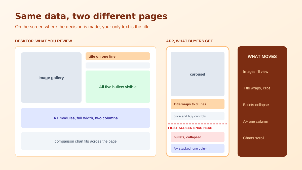
On a phone the opening view is dominated by the image carousel. Below it sit the title, the rating summary, the price and the purchase controls, and on many products a variation selector. That is often the entire first screen. The bullets, which most sellers treat as their primary sales copy, usually require a deliberate scroll, and even then they arrive partially collapsed with an expansion control underneath.
The consequence is stark. On the screen where the buy decision is most often made, your text contribution is a title and nothing else. Everything else persuading the shopper at that moment is photographic. Sellers who accept this stop treating images as a compliance task and start treating the carousel as the actual sales page, which is a considerably better allocation of effort than another round of bullet rewriting.
It also changes what belongs in the images. A specification that cannot survive in a truncated bullet can live in an infographic frame instead, where it is read before any body copy. Sizing diagrams, in-the-box layouts and compatibility charts do more work in slot two or three of the carousel than they ever will in text, and the format rules for those frames are set out in the Amazon product image requirements.
There are two different truncations and people conflate them. In search results, the title is given a couple of lines in a narrow grid cell before it clips, which is far less than the field permits. On the detail page it is more generous but still wraps across several lines and competes with the price block for attention. Neither location resembles the single wide line you see when reviewing on a laptop.
Practically, the front of the title has to identify the product and differentiate it, in that order, and everything after that clause exists for indexing and for the reader who has already leaned in. Brand, product type and the single most important attribute belong before the first comma. The ceiling itself has tightened in several categories and the current position is covered in the piece on the Amazon title character limit, but the display cut has always been shorter than the field limit and always will be.
Bullets behave the same way. The label at the front of each one survives every truncation point, and the clause you appended at the end has effectively not been published. If your bullets are vanishing entirely rather than being trimmed, that is a separate and more alarming problem, which the article on bullet points disappearing on Amazon works through.
Worth noting too that shoppers rarely arrive at your amazon listing on mobile in a considered frame of mind. They are in a results grid, thumb moving, comparing four products at a glance, and the tap is often a low-commitment gesture rather than a decision. That raises the value of anything that resolves quickly and lowers the value of anything that requires reading. It is a different persuasion problem to the one a desktop layout implies, and it rewards clarity over completeness at nearly every point on the page.
A+ modules are authored in a wide desktop editor and rendered on a phone as a single narrow column. Two column comparisons stack or scroll. Overlay text that looked like a considered caption at desktop scale becomes a line of grey specks. Background images crop to the centre, which is exactly where designers like to place a product that is now half out of frame. None of this is visible in the editor preview at desktop width.
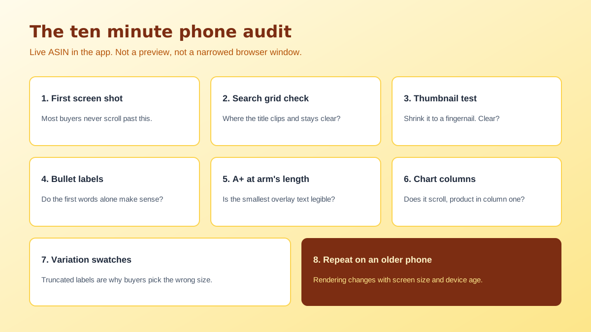
The working rule is to design every module as if it will only ever be seen narrow, and to accept that the desktop rendering will look a little sparse as a result. Large type, one idea per module, high contrast, and no text smaller than you would set for a printed label. A module that reads perfectly on a phone always reads acceptably on a desktop, and the reverse is almost never true. The specific failure modes are enumerated in the Amazon A+ mobile legibility audit.
Comparison charts deserve a separate warning. They are the module most likely to be rendered as a horizontally scrolling table, which means the column a shopper needs to see, usually the one showing your product winning, may sit off screen at the moment they glance at it. Put your own product in the first column, keep the row count low, and use short row labels rather than sentences.
None of this argues for weaker A+ content. It argues for a different brief. A module built for the narrow column carries one message, one image and a headline you could read across a room, which is a harder editorial task than filling a wide canvas and a more useful one. When brands complain that their A+ made no difference, an audit of the amazon listing on mobile usually finds modules that were technically published and practically unreadable.
Before any of this matters, the shopper has to tap through from a results grid where your main image is rendered at something close to thumbnail size. That is the harshest test any of your assets face. Fine surface detail disappears. Thin overlay text is illegible and, on the main image, is not permitted in most categories anyway. Two colourways that look distinct at full size become the same grey blob.
Test it directly: shrink your main image on screen until it is roughly the size of a fingernail and ask whether the product is still identifiable and still appealing. If the answer is no, the fix is composition, filling more of the frame and choosing a stronger angle, not more resolution. Producing several framings of the same product to compare at that scale is exactly the kind of iteration that AI product photography makes cheap enough to actually do.
None of that requires a tool and all of it requires ten minutes. The reason it gets skipped is that Seller Central offers a preview and previews feel authoritative, but that preview is a data check rather than a layout check. Once you have audited two or three products this way, the pattern generalises and you start writing for the narrow column by default. The broader ordering of fixes, from images through copy to structured data, is laid out in the Amazon listing optimization workflow, and if the titles themselves need rebuilding to survive the grid cut, the Amazon listing title generator writes front-loaded ones.
Because the app renders a different layout, not a narrower copy of the desktop one. Blocks are reordered, several are collapsed behind expansion controls, and the image carousel takes almost the whole first screen. The desktop page and the app page are two presentations of the same data, and only one of them is what most of your buyers receive.
Treat it as a data check rather than a layout check. It confirms that your content saved and that the fields populated, which is useful, but it does not reproduce the app rendering, the truncation points or the order blocks appear in. Always confirm on the live ASIN in the Amazon app before you decide a listing is finished.
Less than you have written, and less in search results than on the detail page. The grid gives a title only a couple of lines before it clips, so the words that identify and differentiate the product need to sit at the front. Anything after the first clause is there for indexing and for the shopper who has already committed to reading.
No, and this catches out most brands. Modules that were designed as a wide desktop layout are stacked into a single narrow column, so a two column comparison becomes a scroll and small overlay text becomes unreadable. Design the modules for the narrow rendering and accept that the desktop version will simply look generous.
Far smaller than your upload. In search results the main image is rendered at roughly thumbnail scale, so fine detail, thin text overlays and subtle colour differences vanish before a shopper ever opens the listing. Judge your main image by shrinking it on screen until it is that size and asking whether the product is still identifiable.
Open the live ASIN in the Amazon app on a normal phone, not a tablet and not a resized desktop browser. Screenshot the first view without scrolling, note where each block stops, and check the main image at search result scale. Ten minutes on a real device finds more than an hour in the preview pane.
ListingRVA AI now works inside Claude. Connect your workspace and ask Claude to generate listing copy and publish product images to your store, without leaving your editor. See the Claude connector →
Comments
No comments yet, be the first.
Leave a comment